

Data Representation in Computer: Number Systems, Characters, Audio, Image and Video

Table of Contents
- 1 What is Data Representation in Computer?
- 2.1 Binary Number System
- 2.2 Octal Number System
- 2.3 Decimal Number System
- 2.4 Hexadecimal Number System
- 3.4 Unicode
- 4 Data Representation of Audio, Image and Video
- 5.1 What is number system with example?
What is Data Representation in Computer?
A computer uses a fixed number of bits to represent a piece of data which could be a number, a character, image, sound, video, etc. Data representation is the method used internally to represent data in a computer. Let us see how various types of data can be represented in computer memory.
Before discussing data representation of numbers, let us see what a number system is.
Number Systems
Number systems are the technique to represent numbers in the computer system architecture, every value that you are saving or getting into/from computer memory has a defined number system.
A number is a mathematical object used to count, label, and measure. A number system is a systematic way to represent numbers. The number system we use in our day-to-day life is the decimal number system that uses 10 symbols or digits.
The number 289 is pronounced as two hundred and eighty-nine and it consists of the symbols 2, 8, and 9. Similarly, there are other number systems. Each has its own symbols and method for constructing a number.
A number system has a unique base, which depends upon the number of symbols. The number of symbols used in a number system is called the base or radix of a number system.
Let us discuss some of the number systems. Computer architecture supports the following number of systems:
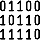
Binary Number System
Octal number system, decimal number system, hexadecimal number system.

A Binary number system has only two digits that are 0 and 1. Every number (value) represents 0 and 1 in this number system. The base of the binary number system is 2 because it has only two digits.
The octal number system has only eight (8) digits from 0 to 7. Every number (value) represents with 0,1,2,3,4,5,6 and 7 in this number system. The base of the octal number system is 8, because it has only 8 digits.
The decimal number system has only ten (10) digits from 0 to 9. Every number (value) represents with 0,1,2,3,4,5,6, 7,8 and 9 in this number system. The base of decimal number system is 10, because it has only 10 digits.
A Hexadecimal number system has sixteen (16) alphanumeric values from 0 to 9 and A to F. Every number (value) represents with 0,1,2,3,4,5,6, 7,8,9,A,B,C,D,E and F in this number system. The base of the hexadecimal number system is 16, because it has 16 alphanumeric values.
Here A is 10, B is 11, C is 12, D is 13, E is 14 and F is 15 .
Data Representation of Characters
There are different methods to represent characters . Some of them are discussed below:

The code called ASCII (pronounced ‘’.S-key”), which stands for American Standard Code for Information Interchange, uses 7 bits to represent each character in computer memory. The ASCII representation has been adopted as a standard by the U.S. government and is widely accepted.
A unique integer number is assigned to each character. This number called ASCII code of that character is converted into binary for storing in memory. For example, the ASCII code of A is 65, its binary equivalent in 7-bit is 1000001.
Since there are exactly 128 unique combinations of 7 bits, this 7-bit code can represent only128 characters. Another version is ASCII-8, also called extended ASCII, which uses 8 bits for each character, can represent 256 different characters.
For example, the letter A is represented by 01000001, B by 01000010 and so on. ASCII code is enough to represent all of the standard keyboard characters.
It stands for Extended Binary Coded Decimal Interchange Code. This is similar to ASCII and is an 8-bit code used in computers manufactured by International Business Machines (IBM). It is capable of encoding 256 characters.
If ASCII-coded data is to be used in a computer that uses EBCDIC representation, it is necessary to transform ASCII code to EBCDIC code. Similarly, if EBCDIC coded data is to be used in an ASCII computer, EBCDIC code has to be transformed to ASCII.
ISCII stands for Indian Standard Code for Information Interchange or Indian Script Code for Information Interchange. It is an encoding scheme for representing various writing systems of India. ISCII uses 8-bits for data representation.
It was evolved by a standardization committee under the Department of Electronics during 1986-88 and adopted by the Bureau of Indian Standards (BIS). Nowadays ISCII has been replaced by Unicode.
Using 8-bit ASCII we can represent only 256 characters. This cannot represent all characters of written languages of the world and other symbols. Unicode is developed to resolve this problem. It aims to provide a standard character encoding scheme, which is universal and efficient.
It provides a unique number for every character, no matter what the language and platform be. Unicode originally used 16 bits which can represent up to 65,536 characters. It is maintained by a non-profit organization called the Unicode Consortium.
The Consortium first published version 1.0.0 in 1991 and continues to develop standards based on that original work. Nowadays Unicode uses more than 16 bits and hence it can represent more characters. Unicode can represent characters in almost all written languages of the world.
Data Representation of Audio, Image and Video
In most cases, we may have to represent and process data other than numbers and characters. This may include audio data, images, and videos. We can see that like numbers and characters, the audio, image, and video data also carry information.
We will see different file formats for storing sound, image, and video .
Multimedia data such as audio, image, and video are stored in different types of files. The variety of file formats is due to the fact that there are quite a few approaches to compressing the data and a number of different ways of packaging the data.
For example, an image is most popularly stored in Joint Picture Experts Group (JPEG ) file format. An image file consists of two parts – header information and image data. Information such as the name of the file, size, modified data, file format, etc. is stored in the header part.
The intensity value of all pixels is stored in the data part of the file. The data can be stored uncompressed or compressed to reduce the file size. Normally, the image data is stored in compressed form. Let us understand what compression is.
Take a simple example of a pure black image of size 400X400 pixels. We can repeat the information black, black, …, black in all 16,0000 (400X400) pixels. This is the uncompressed form, while in the compressed form black is stored only once and information to repeat it 1,60,000 times is also stored.
Numerous such techniques are used to achieve compression. Depending on the application, images are stored in various file formats such as bitmap file format (BMP), Tagged Image File Format (TIFF), Graphics Interchange Format (GIF), Portable (Public) Network Graphic (PNG).
What we said about the header file information and compression is also applicable for audio and video files. Digital audio data can be stored in different file formats like WAV, MP3, MIDI, AIFF, etc. An audio file describes a format, sometimes referred to as the ‘container format’, for storing digital audio data.
For example, WAV file format typically contains uncompressed sound and MP3 files typically contain compressed audio data. The synthesized music data is stored in MIDI(Musical Instrument Digital Interface) files.
Similarly, video is also stored in different files such as AVI (Audio Video Interleave) – a file format designed to store both audio and video data in a standard package that allows synchronous audio with video playback, MP3, JPEG-2, WMV, etc.
FAQs About Data Representation in Computer
What is number system with example.
Let us discuss some of the number systems. Computer architecture supports the following number of systems: 1. Binary Number System 2. Octal Number System 3. Decimal Number System 4. Hexadecimal Number System
Leave a Reply Cancel reply
Save my name, email, and website in this browser for the next time I comment.
Home Blog Design Understanding Data Presentations (Guide + Examples)
Understanding Data Presentations (Guide + Examples)

In this age of overwhelming information, the skill to effectively convey data has become extremely valuable. Initiating a discussion on data presentation types involves thoughtful consideration of the nature of your data and the message you aim to convey. Different types of visualizations serve distinct purposes. Whether you’re dealing with how to develop a report or simply trying to communicate complex information, how you present data influences how well your audience understands and engages with it. This extensive guide leads you through the different ways of data presentation.
Table of Contents
What is a Data Presentation?
What should a data presentation include, line graphs, treemap chart, scatter plot, how to choose a data presentation type, recommended data presentation templates, common mistakes done in data presentation.
A data presentation is a slide deck that aims to disclose quantitative information to an audience through the use of visual formats and narrative techniques derived from data analysis, making complex data understandable and actionable. This process requires a series of tools, such as charts, graphs, tables, infographics, dashboards, and so on, supported by concise textual explanations to improve understanding and boost retention rate.
Data presentations require us to cull data in a format that allows the presenter to highlight trends, patterns, and insights so that the audience can act upon the shared information. In a few words, the goal of data presentations is to enable viewers to grasp complicated concepts or trends quickly, facilitating informed decision-making or deeper analysis.
Data presentations go beyond the mere usage of graphical elements. Seasoned presenters encompass visuals with the art of data storytelling , so the speech skillfully connects the points through a narrative that resonates with the audience. Depending on the purpose – inspire, persuade, inform, support decision-making processes, etc. – is the data presentation format that is better suited to help us in this journey.
To nail your upcoming data presentation, ensure to count with the following elements:
- Clear Objectives: Understand the intent of your presentation before selecting the graphical layout and metaphors to make content easier to grasp.
- Engaging introduction: Use a powerful hook from the get-go. For instance, you can ask a big question or present a problem that your data will answer. Take a look at our guide on how to start a presentation for tips & insights.
- Structured Narrative: Your data presentation must tell a coherent story. This means a beginning where you present the context, a middle section in which you present the data, and an ending that uses a call-to-action. Check our guide on presentation structure for further information.
- Visual Elements: These are the charts, graphs, and other elements of visual communication we ought to use to present data. This article will cover one by one the different types of data representation methods we can use, and provide further guidance on choosing between them.
- Insights and Analysis: This is not just showcasing a graph and letting people get an idea about it. A proper data presentation includes the interpretation of that data, the reason why it’s included, and why it matters to your research.
- Conclusion & CTA: Ending your presentation with a call to action is necessary. Whether you intend to wow your audience into acquiring your services, inspire them to change the world, or whatever the purpose of your presentation, there must be a stage in which you convey all that you shared and show the path to staying in touch. Plan ahead whether you want to use a thank-you slide, a video presentation, or which method is apt and tailored to the kind of presentation you deliver.
- Q&A Session: After your speech is concluded, allocate 3-5 minutes for the audience to raise any questions about the information you disclosed. This is an extra chance to establish your authority on the topic. Check our guide on questions and answer sessions in presentations here.
Bar charts are a graphical representation of data using rectangular bars to show quantities or frequencies in an established category. They make it easy for readers to spot patterns or trends. Bar charts can be horizontal or vertical, although the vertical format is commonly known as a column chart. They display categorical, discrete, or continuous variables grouped in class intervals [1] . They include an axis and a set of labeled bars horizontally or vertically. These bars represent the frequencies of variable values or the values themselves. Numbers on the y-axis of a vertical bar chart or the x-axis of a horizontal bar chart are called the scale.

Real-Life Application of Bar Charts
Let’s say a sales manager is presenting sales to their audience. Using a bar chart, he follows these steps.
Step 1: Selecting Data
The first step is to identify the specific data you will present to your audience.
The sales manager has highlighted these products for the presentation.
- Product A: Men’s Shoes
- Product B: Women’s Apparel
- Product C: Electronics
- Product D: Home Decor
Step 2: Choosing Orientation
Opt for a vertical layout for simplicity. Vertical bar charts help compare different categories in case there are not too many categories [1] . They can also help show different trends. A vertical bar chart is used where each bar represents one of the four chosen products. After plotting the data, it is seen that the height of each bar directly represents the sales performance of the respective product.
It is visible that the tallest bar (Electronics – Product C) is showing the highest sales. However, the shorter bars (Women’s Apparel – Product B and Home Decor – Product D) need attention. It indicates areas that require further analysis or strategies for improvement.
Step 3: Colorful Insights
Different colors are used to differentiate each product. It is essential to show a color-coded chart where the audience can distinguish between products.
- Men’s Shoes (Product A): Yellow
- Women’s Apparel (Product B): Orange
- Electronics (Product C): Violet
- Home Decor (Product D): Blue

Bar charts are straightforward and easily understandable for presenting data. They are versatile when comparing products or any categorical data [2] . Bar charts adapt seamlessly to retail scenarios. Despite that, bar charts have a few shortcomings. They cannot illustrate data trends over time. Besides, overloading the chart with numerous products can lead to visual clutter, diminishing its effectiveness.
For more information, check our collection of bar chart templates for PowerPoint .
Line graphs help illustrate data trends, progressions, or fluctuations by connecting a series of data points called ‘markers’ with straight line segments. This provides a straightforward representation of how values change [5] . Their versatility makes them invaluable for scenarios requiring a visual understanding of continuous data. In addition, line graphs are also useful for comparing multiple datasets over the same timeline. Using multiple line graphs allows us to compare more than one data set. They simplify complex information so the audience can quickly grasp the ups and downs of values. From tracking stock prices to analyzing experimental results, you can use line graphs to show how data changes over a continuous timeline. They show trends with simplicity and clarity.
Real-life Application of Line Graphs
To understand line graphs thoroughly, we will use a real case. Imagine you’re a financial analyst presenting a tech company’s monthly sales for a licensed product over the past year. Investors want insights into sales behavior by month, how market trends may have influenced sales performance and reception to the new pricing strategy. To present data via a line graph, you will complete these steps.
First, you need to gather the data. In this case, your data will be the sales numbers. For example:
- January: $45,000
- February: $55,000
- March: $45,000
- April: $60,000
- May: $ 70,000
- June: $65,000
- July: $62,000
- August: $68,000
- September: $81,000
- October: $76,000
- November: $87,000
- December: $91,000
After choosing the data, the next step is to select the orientation. Like bar charts, you can use vertical or horizontal line graphs. However, we want to keep this simple, so we will keep the timeline (x-axis) horizontal while the sales numbers (y-axis) vertical.
Step 3: Connecting Trends
After adding the data to your preferred software, you will plot a line graph. In the graph, each month’s sales are represented by data points connected by a line.

Step 4: Adding Clarity with Color
If there are multiple lines, you can also add colors to highlight each one, making it easier to follow.
Line graphs excel at visually presenting trends over time. These presentation aids identify patterns, like upward or downward trends. However, too many data points can clutter the graph, making it harder to interpret. Line graphs work best with continuous data but are not suitable for categories.
For more information, check our collection of line chart templates for PowerPoint and our article about how to make a presentation graph .
A data dashboard is a visual tool for analyzing information. Different graphs, charts, and tables are consolidated in a layout to showcase the information required to achieve one or more objectives. Dashboards help quickly see Key Performance Indicators (KPIs). You don’t make new visuals in the dashboard; instead, you use it to display visuals you’ve already made in worksheets [3] .
Keeping the number of visuals on a dashboard to three or four is recommended. Adding too many can make it hard to see the main points [4]. Dashboards can be used for business analytics to analyze sales, revenue, and marketing metrics at a time. They are also used in the manufacturing industry, as they allow users to grasp the entire production scenario at the moment while tracking the core KPIs for each line.
Real-Life Application of a Dashboard
Consider a project manager presenting a software development project’s progress to a tech company’s leadership team. He follows the following steps.
Step 1: Defining Key Metrics
To effectively communicate the project’s status, identify key metrics such as completion status, budget, and bug resolution rates. Then, choose measurable metrics aligned with project objectives.
Step 2: Choosing Visualization Widgets
After finalizing the data, presentation aids that align with each metric are selected. For this project, the project manager chooses a progress bar for the completion status and uses bar charts for budget allocation. Likewise, he implements line charts for bug resolution rates.

Step 3: Dashboard Layout
Key metrics are prominently placed in the dashboard for easy visibility, and the manager ensures that it appears clean and organized.
Dashboards provide a comprehensive view of key project metrics. Users can interact with data, customize views, and drill down for detailed analysis. However, creating an effective dashboard requires careful planning to avoid clutter. Besides, dashboards rely on the availability and accuracy of underlying data sources.
For more information, check our article on how to design a dashboard presentation , and discover our collection of dashboard PowerPoint templates .
Treemap charts represent hierarchical data structured in a series of nested rectangles [6] . As each branch of the ‘tree’ is given a rectangle, smaller tiles can be seen representing sub-branches, meaning elements on a lower hierarchical level than the parent rectangle. Each one of those rectangular nodes is built by representing an area proportional to the specified data dimension.
Treemaps are useful for visualizing large datasets in compact space. It is easy to identify patterns, such as which categories are dominant. Common applications of the treemap chart are seen in the IT industry, such as resource allocation, disk space management, website analytics, etc. Also, they can be used in multiple industries like healthcare data analysis, market share across different product categories, or even in finance to visualize portfolios.
Real-Life Application of a Treemap Chart
Let’s consider a financial scenario where a financial team wants to represent the budget allocation of a company. There is a hierarchy in the process, so it is helpful to use a treemap chart. In the chart, the top-level rectangle could represent the total budget, and it would be subdivided into smaller rectangles, each denoting a specific department. Further subdivisions within these smaller rectangles might represent individual projects or cost categories.
Step 1: Define Your Data Hierarchy
While presenting data on the budget allocation, start by outlining the hierarchical structure. The sequence will be like the overall budget at the top, followed by departments, projects within each department, and finally, individual cost categories for each project.
- Top-level rectangle: Total Budget
- Second-level rectangles: Departments (Engineering, Marketing, Sales)
- Third-level rectangles: Projects within each department
- Fourth-level rectangles: Cost categories for each project (Personnel, Marketing Expenses, Equipment)
Step 2: Choose a Suitable Tool
It’s time to select a data visualization tool supporting Treemaps. Popular choices include Tableau, Microsoft Power BI, PowerPoint, or even coding with libraries like D3.js. It is vital to ensure that the chosen tool provides customization options for colors, labels, and hierarchical structures.
Here, the team uses PowerPoint for this guide because of its user-friendly interface and robust Treemap capabilities.
Step 3: Make a Treemap Chart with PowerPoint
After opening the PowerPoint presentation, they chose “SmartArt” to form the chart. The SmartArt Graphic window has a “Hierarchy” category on the left. Here, you will see multiple options. You can choose any layout that resembles a Treemap. The “Table Hierarchy” or “Organization Chart” options can be adapted. The team selects the Table Hierarchy as it looks close to a Treemap.
Step 5: Input Your Data
After that, a new window will open with a basic structure. They add the data one by one by clicking on the text boxes. They start with the top-level rectangle, representing the total budget.

Step 6: Customize the Treemap
By clicking on each shape, they customize its color, size, and label. At the same time, they can adjust the font size, style, and color of labels by using the options in the “Format” tab in PowerPoint. Using different colors for each level enhances the visual difference.
Treemaps excel at illustrating hierarchical structures. These charts make it easy to understand relationships and dependencies. They efficiently use space, compactly displaying a large amount of data, reducing the need for excessive scrolling or navigation. Additionally, using colors enhances the understanding of data by representing different variables or categories.
In some cases, treemaps might become complex, especially with deep hierarchies. It becomes challenging for some users to interpret the chart. At the same time, displaying detailed information within each rectangle might be constrained by space. It potentially limits the amount of data that can be shown clearly. Without proper labeling and color coding, there’s a risk of misinterpretation.
A heatmap is a data visualization tool that uses color coding to represent values across a two-dimensional surface. In these, colors replace numbers to indicate the magnitude of each cell. This color-shaded matrix display is valuable for summarizing and understanding data sets with a glance [7] . The intensity of the color corresponds to the value it represents, making it easy to identify patterns, trends, and variations in the data.
As a tool, heatmaps help businesses analyze website interactions, revealing user behavior patterns and preferences to enhance overall user experience. In addition, companies use heatmaps to assess content engagement, identifying popular sections and areas of improvement for more effective communication. They excel at highlighting patterns and trends in large datasets, making it easy to identify areas of interest.
We can implement heatmaps to express multiple data types, such as numerical values, percentages, or even categorical data. Heatmaps help us easily spot areas with lots of activity, making them helpful in figuring out clusters [8] . When making these maps, it is important to pick colors carefully. The colors need to show the differences between groups or levels of something. And it is good to use colors that people with colorblindness can easily see.
Check our detailed guide on how to create a heatmap here. Also discover our collection of heatmap PowerPoint templates .
Pie charts are circular statistical graphics divided into slices to illustrate numerical proportions. Each slice represents a proportionate part of the whole, making it easy to visualize the contribution of each component to the total.
The size of the pie charts is influenced by the value of data points within each pie. The total of all data points in a pie determines its size. The pie with the highest data points appears as the largest, whereas the others are proportionally smaller. However, you can present all pies of the same size if proportional representation is not required [9] . Sometimes, pie charts are difficult to read, or additional information is required. A variation of this tool can be used instead, known as the donut chart , which has the same structure but a blank center, creating a ring shape. Presenters can add extra information, and the ring shape helps to declutter the graph.
Pie charts are used in business to show percentage distribution, compare relative sizes of categories, or present straightforward data sets where visualizing ratios is essential.
Real-Life Application of Pie Charts
Consider a scenario where you want to represent the distribution of the data. Each slice of the pie chart would represent a different category, and the size of each slice would indicate the percentage of the total portion allocated to that category.
Step 1: Define Your Data Structure
Imagine you are presenting the distribution of a project budget among different expense categories.
- Column A: Expense Categories (Personnel, Equipment, Marketing, Miscellaneous)
- Column B: Budget Amounts ($40,000, $30,000, $20,000, $10,000) Column B represents the values of your categories in Column A.
Step 2: Insert a Pie Chart
Using any of the accessible tools, you can create a pie chart. The most convenient tools for forming a pie chart in a presentation are presentation tools such as PowerPoint or Google Slides. You will notice that the pie chart assigns each expense category a percentage of the total budget by dividing it by the total budget.
For instance:
- Personnel: $40,000 / ($40,000 + $30,000 + $20,000 + $10,000) = 40%
- Equipment: $30,000 / ($40,000 + $30,000 + $20,000 + $10,000) = 30%
- Marketing: $20,000 / ($40,000 + $30,000 + $20,000 + $10,000) = 20%
- Miscellaneous: $10,000 / ($40,000 + $30,000 + $20,000 + $10,000) = 10%
You can make a chart out of this or just pull out the pie chart from the data.

3D pie charts and 3D donut charts are quite popular among the audience. They stand out as visual elements in any presentation slide, so let’s take a look at how our pie chart example would look in 3D pie chart format.

Step 03: Results Interpretation
The pie chart visually illustrates the distribution of the project budget among different expense categories. Personnel constitutes the largest portion at 40%, followed by equipment at 30%, marketing at 20%, and miscellaneous at 10%. This breakdown provides a clear overview of where the project funds are allocated, which helps in informed decision-making and resource management. It is evident that personnel are a significant investment, emphasizing their importance in the overall project budget.
Pie charts provide a straightforward way to represent proportions and percentages. They are easy to understand, even for individuals with limited data analysis experience. These charts work well for small datasets with a limited number of categories.
However, a pie chart can become cluttered and less effective in situations with many categories. Accurate interpretation may be challenging, especially when dealing with slight differences in slice sizes. In addition, these charts are static and do not effectively convey trends over time.
For more information, check our collection of pie chart templates for PowerPoint .
Histograms present the distribution of numerical variables. Unlike a bar chart that records each unique response separately, histograms organize numeric responses into bins and show the frequency of reactions within each bin [10] . The x-axis of a histogram shows the range of values for a numeric variable. At the same time, the y-axis indicates the relative frequencies (percentage of the total counts) for that range of values.
Whenever you want to understand the distribution of your data, check which values are more common, or identify outliers, histograms are your go-to. Think of them as a spotlight on the story your data is telling. A histogram can provide a quick and insightful overview if you’re curious about exam scores, sales figures, or any numerical data distribution.
Real-Life Application of a Histogram
In the histogram data analysis presentation example, imagine an instructor analyzing a class’s grades to identify the most common score range. A histogram could effectively display the distribution. It will show whether most students scored in the average range or if there are significant outliers.
Step 1: Gather Data
He begins by gathering the data. The scores of each student in class are gathered to analyze exam scores.
| Names | Score |
|---|---|
| Alice | 78 |
| Bob | 85 |
| Clara | 92 |
| David | 65 |
| Emma | 72 |
| Frank | 88 |
| Grace | 76 |
| Henry | 95 |
| Isabel | 81 |
| Jack | 70 |
| Kate | 60 |
| Liam | 89 |
| Mia | 75 |
| Noah | 84 |
| Olivia | 92 |
After arranging the scores in ascending order, bin ranges are set.
Step 2: Define Bins
Bins are like categories that group similar values. Think of them as buckets that organize your data. The presenter decides how wide each bin should be based on the range of the values. For instance, the instructor sets the bin ranges based on score intervals: 60-69, 70-79, 80-89, and 90-100.
Step 3: Count Frequency
Now, he counts how many data points fall into each bin. This step is crucial because it tells you how often specific ranges of values occur. The result is the frequency distribution, showing the occurrences of each group.
Here, the instructor counts the number of students in each category.
- 60-69: 1 student (Kate)
- 70-79: 4 students (David, Emma, Grace, Jack)
- 80-89: 7 students (Alice, Bob, Frank, Isabel, Liam, Mia, Noah)
- 90-100: 3 students (Clara, Henry, Olivia)
Step 4: Create the Histogram
It’s time to turn the data into a visual representation. Draw a bar for each bin on a graph. The width of the bar should correspond to the range of the bin, and the height should correspond to the frequency. To make your histogram understandable, label the X and Y axes.
In this case, the X-axis should represent the bins (e.g., test score ranges), and the Y-axis represents the frequency.

The histogram of the class grades reveals insightful patterns in the distribution. Most students, with seven students, fall within the 80-89 score range. The histogram provides a clear visualization of the class’s performance. It showcases a concentration of grades in the upper-middle range with few outliers at both ends. This analysis helps in understanding the overall academic standing of the class. It also identifies the areas for potential improvement or recognition.
Thus, histograms provide a clear visual representation of data distribution. They are easy to interpret, even for those without a statistical background. They apply to various types of data, including continuous and discrete variables. One weak point is that histograms do not capture detailed patterns in students’ data, with seven compared to other visualization methods.
A scatter plot is a graphical representation of the relationship between two variables. It consists of individual data points on a two-dimensional plane. This plane plots one variable on the x-axis and the other on the y-axis. Each point represents a unique observation. It visualizes patterns, trends, or correlations between the two variables.
Scatter plots are also effective in revealing the strength and direction of relationships. They identify outliers and assess the overall distribution of data points. The points’ dispersion and clustering reflect the relationship’s nature, whether it is positive, negative, or lacks a discernible pattern. In business, scatter plots assess relationships between variables such as marketing cost and sales revenue. They help present data correlations and decision-making.
Real-Life Application of Scatter Plot
A group of scientists is conducting a study on the relationship between daily hours of screen time and sleep quality. After reviewing the data, they managed to create this table to help them build a scatter plot graph:
| Participant ID | Daily Hours of Screen Time | Sleep Quality Rating |
|---|---|---|
| 1 | 9 | 3 |
| 2 | 2 | 8 |
| 3 | 1 | 9 |
| 4 | 0 | 10 |
| 5 | 1 | 9 |
| 6 | 3 | 7 |
| 7 | 4 | 7 |
| 8 | 5 | 6 |
| 9 | 5 | 6 |
| 10 | 7 | 3 |
| 11 | 10 | 1 |
| 12 | 6 | 5 |
| 13 | 7 | 3 |
| 14 | 8 | 2 |
| 15 | 9 | 2 |
| 16 | 4 | 7 |
| 17 | 5 | 6 |
| 18 | 4 | 7 |
| 19 | 9 | 2 |
| 20 | 6 | 4 |
| 21 | 3 | 7 |
| 22 | 10 | 1 |
| 23 | 2 | 8 |
| 24 | 5 | 6 |
| 25 | 3 | 7 |
| 26 | 1 | 9 |
| 27 | 8 | 2 |
| 28 | 4 | 6 |
| 29 | 7 | 3 |
| 30 | 2 | 8 |
| 31 | 7 | 4 |
| 32 | 9 | 2 |
| 33 | 10 | 1 |
| 34 | 10 | 1 |
| 35 | 10 | 1 |
In the provided example, the x-axis represents Daily Hours of Screen Time, and the y-axis represents the Sleep Quality Rating.

The scientists observe a negative correlation between the amount of screen time and the quality of sleep. This is consistent with their hypothesis that blue light, especially before bedtime, has a significant impact on sleep quality and metabolic processes.
There are a few things to remember when using a scatter plot. Even when a scatter diagram indicates a relationship, it doesn’t mean one variable affects the other. A third factor can influence both variables. The more the plot resembles a straight line, the stronger the relationship is perceived [11] . If it suggests no ties, the observed pattern might be due to random fluctuations in data. When the scatter diagram depicts no correlation, whether the data might be stratified is worth considering.
Choosing the appropriate data presentation type is crucial when making a presentation . Understanding the nature of your data and the message you intend to convey will guide this selection process. For instance, when showcasing quantitative relationships, scatter plots become instrumental in revealing correlations between variables. If the focus is on emphasizing parts of a whole, pie charts offer a concise display of proportions. Histograms, on the other hand, prove valuable for illustrating distributions and frequency patterns.
Bar charts provide a clear visual comparison of different categories. Likewise, line charts excel in showcasing trends over time, while tables are ideal for detailed data examination. Starting a presentation on data presentation types involves evaluating the specific information you want to communicate and selecting the format that aligns with your message. This ensures clarity and resonance with your audience from the beginning of your presentation.
1. Fact Sheet Dashboard for Data Presentation

Convey all the data you need to present in this one-pager format, an ideal solution tailored for users looking for presentation aids. Global maps, donut chats, column graphs, and text neatly arranged in a clean layout presented in light and dark themes.
Use This Template
2. 3D Column Chart Infographic PPT Template

Represent column charts in a highly visual 3D format with this PPT template. A creative way to present data, this template is entirely editable, and we can craft either a one-page infographic or a series of slides explaining what we intend to disclose point by point.
3. Data Circles Infographic PowerPoint Template

An alternative to the pie chart and donut chart diagrams, this template features a series of curved shapes with bubble callouts as ways of presenting data. Expand the information for each arch in the text placeholder areas.
4. Colorful Metrics Dashboard for Data Presentation

This versatile dashboard template helps us in the presentation of the data by offering several graphs and methods to convert numbers into graphics. Implement it for e-commerce projects, financial projections, project development, and more.
5. Animated Data Presentation Tools for PowerPoint & Google Slides

A slide deck filled with most of the tools mentioned in this article, from bar charts, column charts, treemap graphs, pie charts, histogram, etc. Animated effects make each slide look dynamic when sharing data with stakeholders.
6. Statistics Waffle Charts PPT Template for Data Presentations

This PPT template helps us how to present data beyond the typical pie chart representation. It is widely used for demographics, so it’s a great fit for marketing teams, data science professionals, HR personnel, and more.
7. Data Presentation Dashboard Template for Google Slides

A compendium of tools in dashboard format featuring line graphs, bar charts, column charts, and neatly arranged placeholder text areas.
8. Weather Dashboard for Data Presentation

Share weather data for agricultural presentation topics, environmental studies, or any kind of presentation that requires a highly visual layout for weather forecasting on a single day. Two color themes are available.
9. Social Media Marketing Dashboard Data Presentation Template

Intended for marketing professionals, this dashboard template for data presentation is a tool for presenting data analytics from social media channels. Two slide layouts featuring line graphs and column charts.
10. Project Management Summary Dashboard Template

A tool crafted for project managers to deliver highly visual reports on a project’s completion, the profits it delivered for the company, and expenses/time required to execute it. 4 different color layouts are available.
11. Profit & Loss Dashboard for PowerPoint and Google Slides

A must-have for finance professionals. This typical profit & loss dashboard includes progress bars, donut charts, column charts, line graphs, and everything that’s required to deliver a comprehensive report about a company’s financial situation.
Overwhelming visuals
One of the mistakes related to using data-presenting methods is including too much data or using overly complex visualizations. They can confuse the audience and dilute the key message.
Inappropriate chart types
Choosing the wrong type of chart for the data at hand can lead to misinterpretation. For example, using a pie chart for data that doesn’t represent parts of a whole is not right.
Lack of context
Failing to provide context or sufficient labeling can make it challenging for the audience to understand the significance of the presented data.
Inconsistency in design
Using inconsistent design elements and color schemes across different visualizations can create confusion and visual disarray.
Failure to provide details
Simply presenting raw data without offering clear insights or takeaways can leave the audience without a meaningful conclusion.
Lack of focus
Not having a clear focus on the key message or main takeaway can result in a presentation that lacks a central theme.
Visual accessibility issues
Overlooking the visual accessibility of charts and graphs can exclude certain audience members who may have difficulty interpreting visual information.
In order to avoid these mistakes in data presentation, presenters can benefit from using presentation templates . These templates provide a structured framework. They ensure consistency, clarity, and an aesthetically pleasing design, enhancing data communication’s overall impact.
Understanding and choosing data presentation types are pivotal in effective communication. Each method serves a unique purpose, so selecting the appropriate one depends on the nature of the data and the message to be conveyed. The diverse array of presentation types offers versatility in visually representing information, from bar charts showing values to pie charts illustrating proportions.
Using the proper method enhances clarity, engages the audience, and ensures that data sets are not just presented but comprehensively understood. By appreciating the strengths and limitations of different presentation types, communicators can tailor their approach to convey information accurately, developing a deeper connection between data and audience understanding.
[1] Government of Canada, S.C. (2021) 5 Data Visualization 5.2 Bar Chart , 5.2 Bar chart . https://www150.statcan.gc.ca/n1/edu/power-pouvoir/ch9/bargraph-diagrammeabarres/5214818-eng.htm
[2] Kosslyn, S.M., 1989. Understanding charts and graphs. Applied cognitive psychology, 3(3), pp.185-225. https://apps.dtic.mil/sti/pdfs/ADA183409.pdf
[3] Creating a Dashboard . https://it.tufts.edu/book/export/html/1870
[4] https://www.goldenwestcollege.edu/research/data-and-more/data-dashboards/index.html
[5] https://www.mit.edu/course/21/21.guide/grf-line.htm
[6] Jadeja, M. and Shah, K., 2015, January. Tree-Map: A Visualization Tool for Large Data. In GSB@ SIGIR (pp. 9-13). https://ceur-ws.org/Vol-1393/gsb15proceedings.pdf#page=15
[7] Heat Maps and Quilt Plots. https://www.publichealth.columbia.edu/research/population-health-methods/heat-maps-and-quilt-plots
[8] EIU QGIS WORKSHOP. https://www.eiu.edu/qgisworkshop/heatmaps.php
[9] About Pie Charts. https://www.mit.edu/~mbarker/formula1/f1help/11-ch-c8.htm
[10] Histograms. https://sites.utexas.edu/sos/guided/descriptive/numericaldd/descriptiven2/histogram/ [11] https://asq.org/quality-resources/scatter-diagram
Like this article? Please share
Data Analysis, Data Science, Data Visualization Filed under Design
Related Articles

Filed under Google Slides Tutorials • June 3rd, 2024
How To Make a Graph on Google Slides
Creating quality graphics is an essential aspect of designing data presentations. Learn how to make a graph in Google Slides with this guide.

Filed under Design • March 27th, 2024
How to Make a Presentation Graph
Detailed step-by-step instructions to master the art of how to make a presentation graph in PowerPoint and Google Slides. Check it out!

Filed under Presentation Ideas • January 6th, 2024
All About Using Harvey Balls
Among the many tools in the arsenal of the modern presenter, Harvey Balls have a special place. In this article we will tell you all about using Harvey Balls.
Leave a Reply
If you're seeing this message, it means we're having trouble loading external resources on our website.
If you're behind a web filter, please make sure that the domains *.kastatic.org and *.kasandbox.org are unblocked.
To log in and use all the features of Khan Academy, please enable JavaScript in your browser.
Computers and the Internet
Course: computers and the internet > unit 1, how do computers represent data.
- Binary & data
- Bits (binary digits)
Want to join the conversation?
- Upvote Button navigates to signup page
- Downvote Button navigates to signup page
- Flag Button navigates to signup page

Call Us Today! +91 99907 48956 | [email protected]
It is the simplest form of data Presentation often used in schools or universities to provide a clearer picture to students, who are better able to capture the concepts effectively through a pictorial Presentation of simple data.
2. Column chart

It is a simplified version of the pictorial Presentation which involves the management of a larger amount of data being shared during the presentations and providing suitable clarity to the insights of the data.
3. Pie Charts

Pie charts provide a very descriptive & a 2D depiction of the data pertaining to comparisons or resemblance of data in two separate fields.
4. Bar charts

A bar chart that shows the accumulation of data with cuboid bars with different dimensions & lengths which are directly proportionate to the values they represent. The bars can be placed either vertically or horizontally depending on the data being represented.
5. Histograms

It is a perfect Presentation of the spread of numerical data. The main differentiation that separates data graphs and histograms are the gaps in the data graphs.
6. Box plots

Box plot or Box-plot is a way of representing groups of numerical data through quartiles. Data Presentation is easier with this style of graph dealing with the extraction of data to the minutes of difference.

Map Data graphs help you with data Presentation over an area to display the areas of concern. Map graphs are useful to make an exact depiction of data over a vast case scenario.
All these visual presentations share a common goal of creating meaningful insights and a platform to understand and manage the data in relation to the growth and expansion of one’s in-depth understanding of data & details to plan or execute future decisions or actions.
Importance of Data Presentation
Data Presentation could be both can be a deal maker or deal breaker based on the delivery of the content in the context of visual depiction.
Data Presentation tools are powerful communication tools that can simplify the data by making it easily understandable & readable at the same time while attracting & keeping the interest of its readers and effectively showcase large amounts of complex data in a simplified manner.
If the user can create an insightful presentation of the data in hand with the same sets of facts and figures, then the results promise to be impressive.
There have been situations where the user has had a great amount of data and vision for expansion but the presentation drowned his/her vision.
To impress the higher management and top brass of a firm, effective presentation of data is needed.
Data Presentation helps the clients or the audience to not spend time grasping the concept and the future alternatives of the business and to convince them to invest in the company & turn it profitable both for the investors & the company.
Although data presentation has a lot to offer, the following are some of the major reason behind the essence of an effective presentation:-
- Many consumers or higher authorities are interested in the interpretation of data, not the raw data itself. Therefore, after the analysis of the data, users should represent the data with a visual aspect for better understanding and knowledge.
- The user should not overwhelm the audience with a number of slides of the presentation and inject an ample amount of texts as pictures that will speak for themselves.
- Data presentation often happens in a nutshell with each department showcasing their achievements towards company growth through a graph or a histogram.
- Providing a brief description would help the user to attain attention in a small amount of time while informing the audience about the context of the presentation
- The inclusion of pictures, charts, graphs and tables in the presentation help for better understanding the potential outcomes.
- An effective presentation would allow the organization to determine the difference with the fellow organization and acknowledge its flaws. Comparison of data would assist them in decision making.
Recommended Courses

Data Visualization
Using powerbi &tableau.

Tableau for Data Analysis

MySQL Certification Program
The PowerBI Masterclass
Need help call our support team 7:00 am to 10:00 pm (ist) at (+91 999-074-8956 | 9650-308-956), keep in touch, email: [email protected].
WhatsApp us
Page Statistics
| Page Metric | # |
|---|---|
| Views | 0 |
| Avg. time spent | 0 s |
Table Of Contents
- Introduction to Functional Computer
- Fundamentals of Architectural Design
Data Representation
- Instruction Set Architecture : Instructions and Formats
- Instruction Set Architecture : Design Models
- Instruction Set Architecture : Addressing Modes
- Performance Measurements and Issues
- Computer Architecture Assessment 1
- Fixed Point Arithmetic : Addition and Subtraction
- Fixed Point Arithmetic : Multiplication
- Fixed Point Arithmetic : Division
- Floating Point Arithmetic
- Arithmetic Logic Unit Design
- CPU's Data Path
- CPU's Control Unit
- Control Unit Design
- Concepts of Pipelining
- Computer Architecture Assessment 2
- Pipeline Hazards
- Memory Characteristics and Organization
- Cache Memory
- Virtual Memory
- I/O Communication and I/O Controller
- Input/Output Data Transfer
- Direct Memory Access controller and I/O Processor
- CPU Interrupts and Interrupt Handling
- Computer Architecture Assessment 3
Course Computer Architecture
Digital computers store and process information in binary form as digital logic has only two values "1" and "0" or in other words "True or False" or also said as "ON or OFF". This system is called radix 2. We human generally deal with radix 10 i.e. decimal. As a matter of convenience there are many other representations like Octal (Radix 8), Hexadecimal (Radix 16), Binary coded decimal (BCD), Decimal etc.
Every computer's CPU has a width measured in terms of bits such as 8 bit CPU, 16 bit CPU, 32 bit CPU etc. Similarly, each memory location can store a fixed number of bits and is called memory width. Given the size of the CPU and Memory, it is for the programmer to handle his data representation. Most of the readers may be knowing that 4 bits form a Nibble, 8 bits form a byte. The word length is defined by the Instruction Set Architecture of the CPU. The word length may be equal to the width of the CPU.
The memory simply stores information as a binary pattern of 1's and 0's. It is to be interpreted as what the content of a memory location means. If the CPU is in the Fetch cycle, it interprets the fetched memory content to be instruction and decodes based on Instruction format. In the Execute cycle, the information from memory is considered as data. As a common man using a computer, we think computers handle English or other alphabets, special characters or numbers. A programmer considers memory content to be data types of the programming language he uses. Now recall figure 1.2 and 1.3 of chapter 1 to reinforce your thought that conversion happens from computer user interface to internal representation and storage.
- Data Representation in Computers
Information handled by a computer is classified as instruction and data. A broad overview of the internal representation of the information is illustrated in figure 3.1. No matter whether it is data in a numeric or non-numeric form or integer, everything is internally represented in Binary. It is up to the programmer to handle the interpretation of the binary pattern and this interpretation is called Data Representation . These data representation schemes are all standardized by international organizations.
Choice of Data representation to be used in a computer is decided by
- The number types to be represented (integer, real, signed, unsigned, etc.)
- Range of values likely to be represented (maximum and minimum to be represented)
- The Precision of the numbers i.e. maximum accuracy of representation (floating point single precision, double precision etc)
- If non-numeric i.e. character, character representation standard to be chosen. ASCII, EBCDIC, UTF are examples of character representation standards.
- The hardware support in terms of word width, instruction.
Before we go into the details, let us take an example of interpretation. Say a byte in Memory has value "0011 0001". Although there exists a possibility of so many interpretations as in figure 3.2, the program has only one interpretation as decided by the programmer and declared in the program.
- Fixed point Number Representation
Fixed point numbers are also known as whole numbers or Integers. The number of bits used in representing the integer also implies the maximum number that can be represented in the system hardware. However for the efficiency of storage and operations, one may choose to represent the integer with one Byte, two Bytes, Four bytes or more. This space allocation is translated from the definition used by the programmer while defining a variable as integer short or long and the Instruction Set Architecture.
In addition to the bit length definition for integers, we also have a choice to represent them as below:
- Unsigned Integer : A positive number including zero can be represented in this format. All the allotted bits are utilised in defining the number. So if one is using 8 bits to represent the unsigned integer, the range of values that can be represented is 28 i.e. "0" to "255". If 16 bits are used for representing then the range is 216 i.e. "0 to 65535".
- Signed Integer : In this format negative numbers, zero, and positive numbers can be represented. A sign bit indicates the magnitude direction as positive or negative. There are three possible representations for signed integer and these are Sign Magnitude format, 1's Compliment format and 2's Complement format .
Signed Integer – Sign Magnitude format: Most Significant Bit (MSB) is reserved for indicating the direction of the magnitude (value). A "0" on MSB means a positive number and a "1" on MSB means a negative number. If n bits are used for representation, n-1 bits indicate the absolute value of the number. Examples for n=8:
Examples for n=8:
0010 1111 = + 47 Decimal (Positive number)
1010 1111 = - 47 Decimal (Negative Number)
0111 1110 = +126 (Positive number)
1111 1110 = -126 (Negative Number)
0000 0000 = + 0 (Postive Number)
1000 0000 = - 0 (Negative Number)
Although this method is easy to understand, Sign Magnitude representation has several shortcomings like
- Zero can be represented in two ways causing redundancy and confusion.
- The total range for magnitude representation is limited to 2n-1, although n bits were accounted.
- The separate sign bit makes the addition and subtraction more complicated. Also, comparing two numbers is not straightforward.
Signed Integer – 1’s Complement format: In this format too, MSB is reserved as the sign bit. But the difference is in representing the Magnitude part of the value for negative numbers (magnitude) is inversed and hence called 1’s Complement form. The positive numbers are represented as it is in binary. Let us see some examples to better our understanding.
1101 0000 = - 47 Decimal (Negative Number)
1000 0001 = -126 (Negative Number)
1111 1111 = - 0 (Negative Number)
- Converting a given binary number to its 2's complement form
Step 1 . -x = x' + 1 where x' is the one's complement of x.
Step 2 Extend the data width of the number, fill up with sign extension i.e. MSB bit is used to fill the bits.
Example: -47 decimal over 8bit representation
As you can see zero is not getting represented with redundancy. There is only one way of representing zero. The other problem of the complexity of the arithmetic operation is also eliminated in 2’s complement representation. Subtraction is done as Addition.
More exercises on number conversion are left to the self-interest of readers.
- Floating Point Number system
The maximum number at best represented as a whole number is 2 n . In the Scientific world, we do come across numbers like Mass of an Electron is 9.10939 x 10⁻³¹ Kg. Velocity of light is 2.99792458 x 10⁸ m/s. Imagine to write the number in a piece of paper without exponent and converting into binary for computer representation. Sure you are tired!!. It makes no sense to write a number in non- readable form or non- processible form. Hence we write such large or small numbers using exponent and mantissa. This is said to be Floating Point representation or real number representation. he real number system could have infinite values between 0 and 1.
Representation in computer
Unlike the two's complement representation for integer numbers, Floating Point number uses Sign and Magnitude representation for both mantissa and exponent . In the number 9.10939 x 1031, in decimal form, +31 is Exponent, 9.10939 is known as Fraction . Mantissa, Significand and fraction are synonymously used terms. In the computer, the representation is binary and the binary point is not fixed. For example, a number, say, 23.345 can be written as 2.3345 x 101 or 0.23345 x 10² or 2334.5 x 10-2. The representation 2.3345 x 101 is said to be in normalised form.
Floating-point numbers usually use multiple words in memory as we need to allot a sign bit, few bits for exponent and many bits for mantissa. There are standards for such allocation which we will see sooner.
- IEEE 754 Floating Point Representation
We have two standards known as Single Precision and Double Precision from IEEE. These standards enable portability among different computers. Figure 3.3 picturizes Single precision while figure 3.4 picturizes double precision. Single Precision uses 32bit format while double precision is 64 bits word length. As the name suggests double precision can represent fractions with larger accuracy. In both the cases, MSB is sign bit for the mantissa part, followed by Exponent and Mantissa. The exponent part has its sign bit.
It is to be noted that in Single Precision, we can represent an exponent in the range -127 to +127. It is possible as a result of arithmetic operations the resulting exponent may not fit in. This situation is called overflow in the case of positive exponent and underflow in the case of negative exponent. The Double Precision format has 11 bits for exponent meaning a number as large as -1023 to 1023 can be represented. The programmer has to make a choice between Single Precision and Double Precision declaration using his knowledge about the data being handled.
The Floating Point operations on the regular CPU is very very slow. Generally, a special purpose CPU known as Co-processor is used. This Co-processor works in tandem with the main CPU. The programmer should be using the float declaration only if his data is in real number form. Float declaration is not to be used generously.
- Decimal Numbers Representation
Decimal numbers (radix 10) are represented and processed in the system with the support of additional hardware. We deal with numbers in decimal format in everyday life. Some machines implement decimal arithmetic too, like floating-point arithmetic hardware. In such a case, the CPU uses decimal numbers in BCD (binary coded decimal) form and does BCD arithmetic operation. BCD operates on radix 10. This hardware operates without conversion to pure binary. It uses a nibble to represent a number in packed BCD form. BCD operations require not only special hardware but also decimal instruction set.
- Exceptions and Error Detection
All of us know that when we do arithmetic operations, we get answers which have more digits than the operands (Ex: 8 x 2= 16). This happens in computer arithmetic operations too. When the result size exceeds the allotted size of the variable or the register, it becomes an error and exception. The exception conditions associated with numbers and number operations are Overflow, Underflow, Truncation, Rounding and Multiple Precision . These are detected by the associated hardware in arithmetic Unit. These exceptions apply to both Fixed Point and Floating Point operations. Each of these exceptional conditions has a flag bit assigned in the Processor Status Word (PSW). We may discuss more in detail in the later chapters.
- Character Representation
Another data type is non-numeric and is largely character sets. We use a human-understandable character set to communicate with computer i.e. for both input and output. Standard character sets like EBCDIC and ASCII are chosen to represent alphabets, numbers and special characters. Nowadays Unicode standard is also in use for non-English language like Chinese, Hindi, Spanish, etc. These codes are accessible and available on the internet. Interested readers may access and learn more.
1. Track your progress [Earn 200 points]
Mark as complete
2. Provide your ratings to this chapter [Earn 100 points]
Data representation 1: Introduction
This course investigates how systems software works: what makes programs work fast or slow, and how properties of the machines we program impact the programs we write. We discuss both general ideas and specific tools, and take an experimental approach.
Textbook readings
- How do computers represent different kinds of information?
- How do data representation choices impact performance and correctness?
- What kind of language is understood by computer processors?
- How is code you write translated to code a processor runs?
- How do hardware and software defend against bugs and attacks?
- How are operating systems interfaces implemented?
- What kinds of computer data storage are available, and how do they perform?
- How can we improve the performance of a system that stores data?
- How can programs on the same computer cooperate and interact?
- What kinds of operating systems interfaces are useful?
- How can a single program safely use multiple processors?
- How can multiple computers safely interact over a network?
- Six problem sets
- Midterm and final
- Starting mid-next week
- Attendance checked for simultaneously-enrolled students
- Rough breakdown: >50% assignments, <35% tests, 15% participation
- Course grading: A means mastery
Collaboration
Discussion, collaboration, and the exchange of ideas are essential to doing academic work, and to engineering. You are encouraged to consult with your classmates as you work on problem sets. You are welcome to discuss general strategies for solutions as well as specific bugs and code structure questions, and to use Internet resources for general information.
However, the work you turn in must be your own—the result of your own efforts. You should understand your code well enough that you could replicate your solution from scratch, without collaboration.
In addition, you must cite any books, articles, online resources, and so forth that helped you with your work, using appropriate citation practices; and you must list the names of students with whom you have collaborated on problem sets and briefly describe how you collaborated. (You do not need to list course staff.)
On our programming language
We use the C++ programming language in this class.
C++ is a boring, old, and unsafe programming language, but boring languages are underrated . C++ offers several important advantages for this class, including ubiquitous availability, good tooling, the ability to demonstrate impactful kinds of errors that you should understand, and a good standard library of data structures.
Pset 0 links to several C++ tutorials and references, and to a textbook.
Each program runs in a private data storage space. This is called its memory . The memory “remembers” the data it stores.
Programs work by manipulating values . Different programming languages have different conceptions of value; in C++, the primitive values are integers, like 12 or -100; floating-point numbers, like 1.02; and pointers , which are references to other objects.
An object is a region of memory that contains a value. (The C++ standard specifically says “a region of data storage in the execution environment, the contents of which can represent values”.)
Objects, values, and variables
Which are the objects? Which are the values?
Variables generally correspond to objects, and here there are three objects, one for each variable i1 , i2 , and i3 . The compiler and operating system associate the names with their corresponding objects. There are three values, too, one used to initialize each object: 61 , 62 , and 63 . However, there are other values—for instance, each argument to the printf calls is a value.
What does the program print?
i1: 61 i2: 62 i3: 63
C and C++ pointer types allow programs to access objects indirectly. A pointer value is the address of another object. For instance, in this program, the variable i4 holds a pointer to the object named by i3 :
There are four objects, corresponding to variables i1 through i4 . Note that the i4 object holds a pointer value, not an integer. There are also four values: 61 , 62 , 63 , and the expression &i3 (the address of i3 ). Note that there are three integer values, but four values overall.
What does this program print?
i1: 61 i2: 62 i3: 63 value pointed to by i4: 63
Here, the expressions i3 and *i4 refer to exactly the same object. Any modification to i3 can be observed through *i4 and vice versa. We say that i3 and *i4 are aliases : different names for the same object.
We now use hexdump_object , a helper function declared in our hexdump.hh helper file , to examine both the contents and the addresses of these objects.
Exactly what is printed will vary between operating systems and compilers. In Docker in class, on my Apple-silicon Macbook, we saw:
But on an Intel-based Amazon EC2 native Linux machine:
The data bytes look similar—identical for i1 through i3 —but the addresses vary.
But on Intel Mac OS X: 103c63020 3d 00 00 00 |=...| 103c5ef60 3e 00 00 00 |>...| 7ffeebfa4abc 3f 00 00 00 |?...| 7ffeebfa4ab0 bc 4a fa eb fe 7f 00 00 |.J......| And on Docker on an Intel Mac: 56499f239010 3d 00 00 00 |=...| 56499f23701c 3e 00 00 00 |>...| 7fffebf8b19c 3f 00 00 00 |?...| 7fffebf8b1a0 9c b1 f8 eb ff 7f 00 00 |........|
A hexdump printout shows the following information on each line.
- An address , like 4000004010 . This is a hexadecimal (base-16) number indicating the value of the address of the object. A line contains one to sixteen bytes of memory starting at this address.
- The contents of memory starting at the given address, such as 3d 00 00 00 . Memory is printed as a sequence of bytes , which are 8-bit numbers between 0 and 255. All modern computers organize their memory in units of 8-bit bytes.
- A textual representation of the memory contents, such as |=...| . This is useful when examining memory that contains textual data, and random garbage otherwise.
Dynamic allocation
Must every data object be given a name? No! In C++, the new operator allocates a brand-new object with no variable name. (In C, the malloc function does the same thing.) The C++ expression new T returns a pointer to a brand-new, never-before-seen object of type T . For instance:
This prints something like
The new int{64} expression allocates a fresh object with no name of its own, though it can be located by following the i4 pointer.
What do you notice about the addresses of these different objects?
- i3 and i4 , which are objects corresponding to variables declared local to main , are located very close to one another. In fact they are just 4 bytes part: i3 directly abuts i4 . Their addresses are quite high. In native Linux, in fact, their addresses are close to 2 47 !
- i1 and i2 are at much lower addresses, and they do not abut. i2 ’s location is below i1 , and about 0x2000 bytes away.
- The anonymous storage allocated by new int is located between i1 / i2 and i3 / i4 .
Although the values may differ on other operating systems, you’ll see qualitatively similar results wherever you run ./objects .
What’s happening is that the operating system and compiler have located different kinds of object in different broad regions of memory. These regions are called segments , and they are important because objects’ different storage characteristics benefit from different treatment.
i2 , the const int global object, has the smallest address. It is in the code or text segment, which is also used for read-only global data. The operating system and hardware ensure that data in this segment is not changed during the lifetime of the program. Any attempt to modify data in the code segment will cause a crash.
i1 , the int global object, has the next highest address. It is in the data segment, which holds modifiable global data. This segment keeps the same size as the program runs.
After a jump, the anonymous new int object pointed to by i4 has the next highest address. This is the heap segment, which holds dynamically allocated data. This segment can grow as the program runs; it typically grows towards higher addresses.
After a larger jump, the i3 and i4 objects have the highest addresses. They are in the stack segment, which holds local variables. This segment can also grow as the program runs, especially as functions call other functions; in most processors it grows down , from higher addresses to lower addresses.
Experimenting with the stack
How can we tell that the stack grows down? Do all functions share a single stack? This program uses a recursive function to test. Try running it; what do you see?
Data representation
Computers use binary - the digits 0 and 1 - to store data. A binary digit, or bit, is the smallest unit of data in computing. It is represented by a 0 or a 1. Binary numbers are made up of binary digits (bits), eg the binary number 1001. The circuits in a computer's processor are made up of billions of transistors. A transistor is a tiny switch that is activated by the electronic signals it receives. The digits 1 and 0 used in binary reflect the on and off states of a transistor. Computer programs are sets of instructions. Each instruction is translated into machine code - simple binary codes that activate the CPU. Programmers write computer code and this is converted by a translator into binary instructions that the processor can execute. All software, music, documents, and any other information that is processed by a computer, is also stored using binary. [1]
To include strings, integers, characters and colours. This should include considering the space taken by data, for instance the relation between the hexadecimal representation of colours and the number of colours available.
This video is superb place to understand this topic
- 1 How a file is stored on a computer
- 2 How an image is stored in a computer
- 3 The way in which data is represented in the computer.
- 6 Standards
- 7 References
How a file is stored on a computer [ edit ]
How an image is stored in a computer [ edit ]
The way in which data is represented in the computer. [ edit ].
To include strings, integers, characters and colours. This should include considering the space taken by data, for instance the relation between the hexadecimal representation of colours and the number of colours available [3] .
This helpful material is used with gratitude from a computer science wiki under a Creative Commons Attribution 3.0 License [4]
Sound [ edit ]
- Let's look at an oscilloscope
- The BBC has an excellent article on how computers represent sound
See Also [ edit ]
Standards [ edit ].
- Outline the way in which data is represented in the computer.
References [ edit ]
- ↑ http://www.bbc.co.uk/education/guides/zwsbwmn/revision/1
- ↑ https://ujjwalkarn.me/2016/08/11/intuitive-explanation-convnets/
- ↑ IBO Computer Science Guide, First exams 2014
- ↑ https://compsci2014.wikispaces.com/2.1.10+Outline+the+way+in+which+data+is+represented+in+the+computer
A unit of abstract mathematical system subject to the laws of arithmetic.
A natural number, a negative of a natural number, or zero.
Give a brief account.
- Computer organization
- Very important ideas in computer science
Data presentation: A comprehensive guide
Learn how to create data presentation effectively and communicate your insights in a way that is clear, concise, and engaging.
Raja Bothra
Building presentations

Hey there, fellow data enthusiast!
Welcome to our comprehensive guide on data presentation.
Whether you're an experienced presenter or just starting, this guide will help you present your data like a pro. We'll dive deep into what data presentation is, why it's crucial, and how to master it. So, let's embark on this data-driven journey together.
What is data presentation?
Data presentation is the art of transforming raw data into a visual format that's easy to understand and interpret. It's like turning numbers and statistics into a captivating story that your audience can quickly grasp. When done right, data presentation can be a game-changer, enabling you to convey complex information effectively.
Why are data presentations important?
Imagine drowning in a sea of numbers and figures. That's how your audience might feel without proper data presentation. Here's why it's essential:
- Clarity : Data presentations make complex information clear and concise.
- Engagement : Visuals, such as charts and graphs, grab your audience's attention.
- Comprehension : Visual data is easier to understand than long, numerical reports.
- Decision-making : Well-presented data aids informed decision-making.
- Impact : It leaves a lasting impression on your audience.
Types of data presentation:
Now, let's delve into the diverse array of data presentation methods, each with its own unique strengths and applications. We have three primary types of data presentation, and within these categories, numerous specific visualization techniques can be employed to effectively convey your data.
1. Textual presentation
Textual presentation harnesses the power of words and sentences to elucidate and contextualize your data. This method is commonly used to provide a narrative framework for the data, offering explanations, insights, and the broader implications of your findings. It serves as a foundation for a deeper understanding of the data's significance.
2. Tabular presentation
Tabular presentation employs tables to arrange and structure your data systematically. These tables are invaluable for comparing various data groups or illustrating how data evolves over time. They present information in a neat and organized format, facilitating straightforward comparisons and reference points.
3. Graphical presentation
Graphical presentation harnesses the visual impact of charts and graphs to breathe life into your data. Charts and graphs are powerful tools for spotlighting trends, patterns, and relationships hidden within the data. Let's explore some common graphical presentation methods:
- Bar charts: They are ideal for comparing different categories of data. In this method, each category is represented by a distinct bar, and the height of the bar corresponds to the value it represents. Bar charts provide a clear and intuitive way to discern differences between categories.
- Pie charts: It excel at illustrating the relative proportions of different data categories. Each category is depicted as a slice of the pie, with the size of each slice corresponding to the percentage of the total value it represents. Pie charts are particularly effective for showcasing the distribution of data.
- Line graphs: They are the go-to choice when showcasing how data evolves over time. Each point on the line represents a specific value at a particular time period. This method enables viewers to track trends and fluctuations effortlessly, making it perfect for visualizing data with temporal dimensions.
- Scatter plots: They are the tool of choice when exploring the relationship between two variables. In this method, each point on the plot represents a pair of values for the two variables in question. Scatter plots help identify correlations, outliers, and patterns within data pairs.
The selection of the most suitable data presentation method hinges on the specific dataset and the presentation's objectives. For instance, when comparing sales figures of different products, a bar chart shines in its simplicity and clarity. On the other hand, if your aim is to display how a product's sales have changed over time, a line graph provides the ideal visual narrative.
Additionally, it's crucial to factor in your audience's level of familiarity with data presentations. For a technical audience, more intricate visualization methods may be appropriate. However, when presenting to a general audience, opting for straightforward and easily understandable visuals is often the wisest choice.
In the world of data presentation, choosing the right method is akin to selecting the perfect brush for a masterpiece. Each tool has its place, and understanding when and how to use them is key to crafting compelling and insightful presentations. So, consider your data carefully, align your purpose, and paint a vivid picture that resonates with your audience.
What to include in data presentation?
When creating your data presentation, remember these key components:
- Data points : Clearly state the data points you're presenting.
- Comparison : Highlight comparisons and trends in your data.
- Graphical methods : Choose the right chart or graph for your data.
- Infographics : Use visuals like infographics to make information more digestible.
- Numerical values : Include numerical values to support your visuals.
- Qualitative information : Explain the significance of the data.
- Source citation : Always cite your data sources.
How to structure an effective data presentation?
Creating a well-structured data presentation is not just important; it's the backbone of a successful presentation. Here's a step-by-step guide to help you craft a compelling and organized presentation that captivates your audience:
1. Know your audience
Understanding your audience is paramount. Consider their needs, interests, and existing knowledge about your topic. Tailor your presentation to their level of understanding, ensuring that it resonates with them on a personal level. Relevance is the key.
2. Have a clear message
Every effective data presentation should convey a clear and concise message. Determine what you want your audience to learn or take away from your presentation, and make sure your message is the guiding light throughout your presentation. Ensure that all your data points align with and support this central message.
3. Tell a compelling story
Human beings are naturally wired to remember stories. Incorporate storytelling techniques into your presentation to make your data more relatable and memorable. Your data can be the backbone of a captivating narrative, whether it's about a trend, a problem, or a solution. Take your audience on a journey through your data.
4. Leverage visuals
Visuals are a powerful tool in data presentation. They make complex information accessible and engaging. Utilize charts, graphs, and images to illustrate your points and enhance the visual appeal of your presentation. Visuals should not just be an accessory; they should be an integral part of your storytelling.
5. Be clear and concise
Avoid jargon or technical language that your audience may not comprehend. Use plain language and explain your data points clearly. Remember, clarity is king. Each piece of information should be easy for your audience to digest.
6. Practice your delivery
Practice makes perfect. Rehearse your presentation multiple times before the actual delivery. This will help you deliver it smoothly and confidently, reducing the chances of stumbling over your words or losing track of your message.
A basic structure for an effective data presentation
Armed with a comprehensive comprehension of how to construct a compelling data presentation, you can now utilize this fundamental template for guidance:
In the introduction, initiate your presentation by introducing both yourself and the topic at hand. Clearly articulate your main message or the fundamental concept you intend to communicate.
Moving on to the body of your presentation, organize your data in a coherent and easily understandable sequence. Employ visuals generously to elucidate your points and weave a narrative that enhances the overall story. Ensure that the arrangement of your data aligns with and reinforces your central message.
As you approach the conclusion, succinctly recapitulate your key points and emphasize your core message once more. Conclude by leaving your audience with a distinct and memorable takeaway, ensuring that your presentation has a lasting impact.
Additional tips for enhancing your data presentation
To take your data presentation to the next level, consider these additional tips:
- Consistent design : Maintain a uniform design throughout your presentation. This not only enhances visual appeal but also aids in seamless comprehension.
- High-quality visuals : Ensure that your visuals are of high quality, easy to read, and directly relevant to your topic.
- Concise text : Avoid overwhelming your slides with excessive text. Focus on the most critical points, using visuals to support and elaborate.
- Anticipate questions : Think ahead about the questions your audience might pose. Be prepared with well-thought-out answers to foster productive discussions.
By following these guidelines, you can structure an effective data presentation that not only informs but also engages and inspires your audience. Remember, a well-structured presentation is the bridge that connects your data to your audience's understanding and appreciation.
Do’s and don'ts on a data presentation
- Use visuals : Incorporate charts and graphs to enhance understanding.
- Keep it simple : Avoid clutter and complexity.
- Highlight key points : Emphasize crucial data.
- Engage the audience : Encourage questions and discussions.
- Practice : Rehearse your presentation.
Don'ts:
- Overload with data : Less is often more; don't overwhelm your audience.
- Fit Unrelated data : Stay on topic; don't include irrelevant information.
- Neglect the audience : Ensure your presentation suits your audience's level of expertise.
- Read word-for-word : Avoid reading directly from slides.
- Lose focus : Stick to your presentation's purpose.
Summarizing key takeaways
- Definition : Data presentation is the art of visualizing complex data for better understanding.
- Importance : Data presentations enhance clarity, engage the audience, aid decision-making, and leave a lasting impact.
- Types : Textual, Tabular, and Graphical presentations offer various ways to present data.
- Choosing methods : Select the right method based on data, audience, and purpose.
- Components : Include data points, comparisons, visuals, infographics, numerical values, and source citations.
- Structure : Know your audience, have a clear message, tell a compelling story, use visuals, be concise, and practice.
- Do's and don'ts : Do use visuals, keep it simple, highlight key points, engage the audience, and practice. Don't overload with data, include unrelated information, neglect the audience's expertise, read word-for-word, or lose focus.
FAQ's on a data presentation
1. what is data presentation, and why is it important in 2024.
Data presentation is the process of visually representing data sets to convey information effectively to an audience. In an era where the amount of data generated is vast, visually presenting data using methods such as diagrams, graphs, and charts has become crucial. By simplifying complex data sets, presentation of the data may helps your audience quickly grasp much information without drowning in a sea of chart's, analytics, facts and figures.
2. What are some common methods of data presentation?
There are various methods of data presentation, including graphs and charts, histograms, and cumulative frequency polygons. Each method has its strengths and is often used depending on the type of data you're using and the message you want to convey. For instance, if you want to show data over time, try using a line graph. If you're presenting geographical data, consider to use a heat map.
3. How can I ensure that my data presentation is clear and readable?
To ensure that your data presentation is clear and readable, pay attention to the design and labeling of your charts. Don't forget to label the axes appropriately, as they are critical for understanding the values they represent. Don't fit all the information in one slide or in a single paragraph. Presentation software like Prezent and PowerPoint can help you simplify your vertical axis, charts and tables, making them much easier to understand.
4. What are some common mistakes presenters make when presenting data?
One common mistake is trying to fit too much data into a single chart, which can distort the information and confuse the audience. Another mistake is not considering the needs of the audience. Remember that your audience won't have the same level of familiarity with the data as you do, so it's essential to present the data effectively and respond to questions during a Q&A session.
5. How can I use data visualization to present important data effectively on platforms like LinkedIn?
When presenting data on platforms like LinkedIn, consider using eye-catching visuals like bar graphs or charts. Use concise captions and e.g., examples to highlight the single most important information in your data report. Visuals, such as graphs and tables, can help you stand out in the sea of textual content, making your data presentation more engaging and shareable among your LinkedIn connections.
Create your data presentation with prezent
Prezent can be a valuable tool for creating data presentations. Here's how Prezent can help you in this regard:
- Time savings : Prezent saves up to 70% of presentation creation time, allowing you to focus on data analysis and insights.
- On-brand consistency : Ensure 100% brand alignment with Prezent's brand-approved designs for professional-looking data presentations.
- Effortless collaboration : Real-time sharing and collaboration features make it easy for teams to work together on data presentations.
- Data storytelling : Choose from 50+ storylines to effectively communicate data insights and engage your audience.
- Personalization : Create tailored data presentations that resonate with your audience's preferences, enhancing the impact of your data.
In summary, Prezent streamlines the process of creating data presentations by offering time-saving features, ensuring brand consistency, promoting collaboration, and providing tools for effective data storytelling. Whether you need to present data to clients, stakeholders, or within your organization, Prezent can significantly enhance your presentation-making process.
So, go ahead, present your data with confidence, and watch your audience be wowed by your expertise.
Thank you for joining us on this data-driven journey. Stay tuned for more insights, and remember, data presentation is your ticket to making numbers come alive! Sign up for our free trial or book a demo !
More zenpedia articles

Competitor analysis presentation: A comprehensive guide

Mastering data visualization techniques in powerpoint presentations

How to make a presentation longer without losing your audience?
Get the latest from Prezent community
Join thousands of subscribers who receive our best practices on communication, storytelling, presentation design, and more. New tips weekly. (No spam, we promise!)
- Alternatives
10 Methods of Data Presentation with 5 Great Tips to Practice, Best in 2024
Leah Nguyen • 04 July, 2024 • 13 min read
Have you ever presented a data report to your boss/coworkers/teachers thinking it was super dope like you’re some cyber hacker living in the Matrix, but all they saw was a pile of static numbers that seemed pointless and didn't make sense to them?
Understanding digits is rigid . Making people from non-analytical backgrounds understand those digits is even more challenging.
How can you clear up those confusing numbers and make your presentation as clear as the day? Let's check out these best ways to present data. 💎
| How many type of charts are available to present data? | 7 |
| How many charts are there in statistics? | 4, including bar, line, histogram and pie. |
| How many types of charts are available in Excel? | 8 |
| Who invented charts? | William Playfair |
| When were the charts invented? | 18th Century |
More Tips with AhaSlides
- Marketing Presentation
- Survey Result Presentation
- Types of Presentation

Start in seconds.
Get any of the above examples as templates. Sign up for free and take what you want from the template library!
Data Presentation - What Is It?
The term ’data presentation’ relates to the way you present data in a way that makes even the most clueless person in the room understand.
Some say it’s witchcraft (you’re manipulating the numbers in some ways), but we’ll just say it’s the power of turning dry, hard numbers or digits into a visual showcase that is easy for people to digest.
Presenting data correctly can help your audience understand complicated processes, identify trends, and instantly pinpoint whatever is going on without exhausting their brains.
Good data presentation helps…
- Make informed decisions and arrive at positive outcomes . If you see the sales of your product steadily increase throughout the years, it’s best to keep milking it or start turning it into a bunch of spin-offs (shoutout to Star Wars👀).
- Reduce the time spent processing data . Humans can digest information graphically 60,000 times faster than in the form of text. Grant them the power of skimming through a decade of data in minutes with some extra spicy graphs and charts.
- Communicate the results clearly . Data does not lie. They’re based on factual evidence and therefore if anyone keeps whining that you might be wrong, slap them with some hard data to keep their mouths shut.
- Add to or expand the current research . You can see what areas need improvement, as well as what details often go unnoticed while surfing through those little lines, dots or icons that appear on the data board.
Methods of Data Presentation and Examples
Imagine you have a delicious pepperoni, extra-cheese pizza. You can decide to cut it into the classic 8 triangle slices, the party style 12 square slices, or get creative and abstract on those slices.
There are various ways to cut a pizza and you get the same variety with how you present your data. In this section, we will bring you the 10 ways to slice a pizza - we mean to present your data - that will make your company’s most important asset as clear as day. Let's dive into 10 ways to present data efficiently.
#1 - Tabular
Among various types of data presentation, tabular is the most fundamental method, with data presented in rows and columns. Excel or Google Sheets would qualify for the job. Nothing fancy.

This is an example of a tabular presentation of data on Google Sheets. Each row and column has an attribute (year, region, revenue, etc.), and you can do a custom format to see the change in revenue throughout the year.
When presenting data as text, all you do is write your findings down in paragraphs and bullet points, and that’s it. A piece of cake to you, a tough nut to crack for whoever has to go through all of the reading to get to the point.
- 65% of email users worldwide access their email via a mobile device.
- Emails that are optimised for mobile generate 15% higher click-through rates.
- 56% of brands using emojis in their email subject lines had a higher open rate.
(Source: CustomerThermometer )
All the above quotes present statistical information in textual form. Since not many people like going through a wall of texts, you’ll have to figure out another route when deciding to use this method, such as breaking the data down into short, clear statements, or even as catchy puns if you’ve got the time to think of them.
#3 - Pie chart
A pie chart (or a ‘donut chart’ if you stick a hole in the middle of it) is a circle divided into slices that show the relative sizes of data within a whole. If you’re using it to show percentages, make sure all the slices add up to 100%.

The pie chart is a familiar face at every party and is usually recognised by most people. However, one setback of using this method is our eyes sometimes can’t identify the differences in slices of a circle, and it’s nearly impossible to compare similar slices from two different pie charts, making them the villains in the eyes of data analysts.

#4 - Bar chart
The bar chart is a chart that presents a bunch of items from the same category, usually in the form of rectangular bars that are placed at an equal distance from each other. Their heights or lengths depict the values they represent.
They can be as simple as this:

Or more complex and detailed like this example of data presentation. Contributing to an effective statistic presentation, this one is a grouped bar chart that not only allows you to compare categories but also the groups within them as well.

#5 - Histogram
Similar in appearance to the bar chart but the rectangular bars in histograms don’t often have the gap like their counterparts.
Instead of measuring categories like weather preferences or favourite films as a bar chart does, a histogram only measures things that can be put into numbers.

Teachers can use presentation graphs like a histogram to see which score group most of the students fall into, like in this example above.
#6 - Line graph
Recordings to ways of displaying data, we shouldn't overlook the effectiveness of line graphs. Line graphs are represented by a group of data points joined together by a straight line. There can be one or more lines to compare how several related things change over time.

On a line chart’s horizontal axis, you usually have text labels, dates or years, while the vertical axis usually represents the quantity (e.g.: budget, temperature or percentage).
#7 - Pictogram graph
A pictogram graph uses pictures or icons relating to the main topic to visualise a small dataset. The fun combination of colours and illustrations makes it a frequent use at schools.
Pictograms are a breath of fresh air if you want to stay away from the monotonous line chart or bar chart for a while. However, they can present a very limited amount of data and sometimes they are only there for displays and do not represent real statistics.
#8 - Radar chart
If presenting five or more variables in the form of a bar chart is too stuffy then you should try using a radar chart, which is one of the most creative ways to present data.
Radar charts show data in terms of how they compare to each other starting from the same point. Some also call them ‘spider charts’ because each aspect combined looks like a spider web.

Radar charts can be a great use for parents who’d like to compare their child’s grades with their peers to lower their self-esteem. You can see that each angular represents a subject with a score value ranging from 0 to 100. Each student’s score across 5 subjects is highlighted in a different colour.

If you think that this method of data presentation somehow feels familiar, then you’ve probably encountered one while playing Pokémon .
#9 - Heat map
A heat map represents data density in colours. The bigger the number, the more colour intensity that data will be represented.

Most US citizens would be familiar with this data presentation method in geography. For elections, many news outlets assign a specific colour code to a state, with blue representing one candidate and red representing the other. The shade of either blue or red in each state shows the strength of the overall vote in that state.

Another great thing you can use a heat map for is to map what visitors to your site click on. The more a particular section is clicked the ‘hotter’ the colour will turn, from blue to bright yellow to red.
#10 - Scatter plot
If you present your data in dots instead of chunky bars, you’ll have a scatter plot.
A scatter plot is a grid with several inputs showing the relationship between two variables. It’s good at collecting seemingly random data and revealing some telling trends.

For example, in this graph, each dot shows the average daily temperature versus the number of beach visitors across several days. You can see that the dots get higher as the temperature increases, so it’s likely that hotter weather leads to more visitors.
5 Data Presentation Mistakes to Avoid
#1 - assume your audience understands what the numbers represent.
You may know all the behind-the-scenes of your data since you’ve worked with them for weeks, but your audience doesn’t.

Showing without telling only invites more and more questions from your audience, as they have to constantly make sense of your data, wasting the time of both sides as a result.
While showing your data presentations, you should tell them what the data are about before hitting them with waves of numbers first. You can use interactive activities such as polls , word clouds , online quizzes and Q&A sections , combined with icebreaker games , to assess their understanding of the data and address any confusion beforehand.
#2 - Use the wrong type of chart
Charts such as pie charts must have a total of 100% so if your numbers accumulate to 193% like this example below, you’re definitely doing it wrong.

Before making a chart, ask yourself: what do I want to accomplish with my data? Do you want to see the relationship between the data sets, show the up and down trends of your data, or see how segments of one thing make up a whole?
Remember, clarity always comes first. Some data visualisations may look cool, but if they don’t fit your data, steer clear of them.
#3 - Make it 3D
3D is a fascinating graphical presentation example. The third dimension is cool, but full of risks.

Can you see what’s behind those red bars? Because we can’t either. You may think that 3D charts add more depth to the design, but they can create false perceptions as our eyes see 3D objects closer and bigger than they appear, not to mention they cannot be seen from multiple angles.
#4 - Use different types of charts to compare contents in the same category

This is like comparing a fish to a monkey. Your audience won’t be able to identify the differences and make an appropriate correlation between the two data sets.
Next time, stick to one type of data presentation only. Avoid the temptation of trying various data visualisation methods in one go and make your data as accessible as possible.
#5 - Bombard the audience with too much information
The goal of data presentation is to make complex topics much easier to understand, and if you’re bringing too much information to the table, you’re missing the point.

The more information you give, the more time it will take for your audience to process it all. If you want to make your data understandable and give your audience a chance to remember it, keep the information within it to an absolute minimum. You should end your session with open-ended questions to see what your participants really think.
What are the Best Methods of Data Presentation?
Finally, which is the best way to present data?
The answer is…
There is none! Each type of presentation has its own strengths and weaknesses and the one you choose greatly depends on what you’re trying to do.
For example:
- Go for a scatter plot if you’re exploring the relationship between different data values, like seeing whether the sales of ice cream go up because of the temperature or because people are just getting more hungry and greedy each day?
- Go for a line graph if you want to mark a trend over time.
- Go for a heat map if you like some fancy visualisation of the changes in a geographical location, or to see your visitors' behaviour on your website.
- Go for a pie chart (especially in 3D) if you want to be shunned by others because it was never a good idea👇

Frequently Asked Questions
What is a chart presentation.
A chart presentation is a way of presenting data or information using visual aids such as charts, graphs, and diagrams. The purpose of a chart presentation is to make complex information more accessible and understandable for the audience.
When can I use charts for the presentation?
Charts can be used to compare data, show trends over time, highlight patterns, and simplify complex information.
Why should you use charts for presentation?
You should use charts to ensure your contents and visuals look clean, as they are the visual representative, provide clarity, simplicity, comparison, contrast and super time-saving!
What are the 4 graphical methods of presenting data?
Histogram, Smoothed frequency graph, Pie diagram or Pie chart, Cumulative or ogive frequency graph, and Frequency Polygon.

Leah Nguyen
Words that convert, stories that stick. I turn complex ideas into engaging narratives - helping audiences learn, remember, and take action.
Tips to Engage with Polls & Trivia
More from AhaSlides

- SUGGESTED TOPICS
- The Magazine
- Newsletters
- Managing Yourself
- Managing Teams
- Work-life Balance
- The Big Idea
- Data & Visuals
- Reading Lists
- Case Selections
- HBR Learning
- Topic Feeds
- Account Settings
- Email Preferences
Present Your Data Like a Pro
- Joel Schwartzberg

Demystify the numbers. Your audience will thank you.
While a good presentation has data, data alone doesn’t guarantee a good presentation. It’s all about how that data is presented. The quickest way to confuse your audience is by sharing too many details at once. The only data points you should share are those that significantly support your point — and ideally, one point per chart. To avoid the debacle of sheepishly translating hard-to-see numbers and labels, rehearse your presentation with colleagues sitting as far away as the actual audience would. While you’ve been working with the same chart for weeks or months, your audience will be exposed to it for mere seconds. Give them the best chance of comprehending your data by using simple, clear, and complete language to identify X and Y axes, pie pieces, bars, and other diagrammatic elements. Try to avoid abbreviations that aren’t obvious, and don’t assume labeled components on one slide will be remembered on subsequent slides. Every valuable chart or pie graph has an “Aha!” zone — a number or range of data that reveals something crucial to your point. Make sure you visually highlight the “Aha!” zone, reinforcing the moment by explaining it to your audience.
With so many ways to spin and distort information these days, a presentation needs to do more than simply share great ideas — it needs to support those ideas with credible data. That’s true whether you’re an executive pitching new business clients, a vendor selling her services, or a CEO making a case for change.
- JS Joel Schwartzberg oversees executive communications for a major national nonprofit, is a professional presentation coach, and is the author of Get to the Point! Sharpen Your Message and Make Your Words Matter and The Language of Leadership: How to Engage and Inspire Your Team . You can find him on LinkedIn and X. TheJoelTruth
Partner Center
Chapter 18. Data Analysis and Coding
Introduction.
Piled before you lie hundreds of pages of fieldnotes you have taken, observations you’ve made while volunteering at city hall. You also have transcripts of interviews you have conducted with the mayor and city council members. What do you do with all this data? How can you use it to answer your original research question (e.g., “How do political polarization and party membership affect local politics?”)? Before you can make sense of your data, you will have to organize and simplify it in a way that allows you to access it more deeply and thoroughly. We call this process coding . [1] Coding is the iterative process of assigning meaning to the data you have collected in order to both simplify and identify patterns. This chapter introduces you to the process of qualitative data analysis and the basic concept of coding, while the following chapter (chapter 19) will take you further into the various kinds of codes and how to use them effectively.
To those who have not yet conducted a qualitative study, the sheer amount of collected data will be a surprise. Qualitative data can be absolutely overwhelming—it may mean hundreds if not thousands of pages of interview transcripts, or fieldnotes, or retrieved documents. How do you make sense of it? Students often want very clear guidelines here, and although I try to accommodate them as much as possible, in the end, analyzing qualitative data is a bit more of an art than a science: “The process of bringing order, structure, and interpretation to a mass of collected data is messy, ambiguous, time-consuming, creative, and fascinating. It does not proceed in a linear fashion: it is not neat. At times, the researcher may feel like an eccentric and tormented artist; not to worry, this is normal” ( Marshall and Rossman 2016:214 ).
To complicate matters further, each approach (e.g., Grounded Theory, deep ethnography, phenomenology) has its own language and bag of tricks (techniques) when it comes to analysis. Grounded Theory, for example, uses in vivo coding to generate new theoretical insights that emerge from a rigorous but open approach to data analysis. Ethnographers, in contrast, are more focused on creating a rich description of the practices, behaviors, and beliefs that operate in a particular field. They are less interested in generating theory and more interested in getting the picture right, valuing verisimilitude in the presentation. And then there are some researchers who seek to account for the qualitative data using almost quantitative methods of analysis, perhaps counting and comparing the uses of certain narrative frames in media accounts of a phenomenon. Qualitative content analysis (QCA) often includes elements of counting (see chapter 17). For these researchers, having very clear hypotheses and clearly defined “variables” before beginning analysis is standard practice, whereas the same would be expressly forbidden by those researchers, like grounded theorists, taking a more emergent approach.
All that said, there are some helpful techniques to get you started, and these will be presented in this and the following chapter. As you become more of an expert yourself, you may want to read more deeply about the tradition that speaks to your research. But know that there are many excellent qualitative researchers that use what works for any given study, who take what they can from each tradition. Most of us find this permissible (but watch out for the methodological purists that exist among us).

Qualitative Data Analysis as a Long Process!
Although most of this and the following chapter will focus on coding, it is important to understand that coding is just one (very important) aspect of the long data-analysis process. We can consider seven phases of data analysis, each of which is important for moving your voluminous data into “findings” that can be reported to others. The first phase involves data organization. This might mean creating a special password-protected Dropbox folder for storing your digital files. It might mean acquiring computer-assisted qualitative data-analysis software ( CAQDAS ) and uploading all transcripts, fieldnotes, and digital files to its storage repository for eventual coding and analysis. Finding a helpful way to store your material can take a lot of time, and you need to be smart about this from the very beginning. Losing data because of poor filing systems or mislabeling is something you want to avoid. You will also want to ensure that you have procedures in place to protect the confidentiality of your interviewees and informants. Filing signed consent forms (with names) separately from transcripts and linking them through an ID number or other code that only you have access to (and store safely) are important.
Once you have all of your material safely and conveniently stored, you will need to immerse yourself in the data. The second phase consists of reading and rereading or viewing and reviewing all of your data. As you do this, you can begin to identify themes or patterns in the data, perhaps writing short memos to yourself about what you are seeing. You are not committing to anything in this third phase but rather keeping your eyes and mind open to what you see. In an actual study, you may very well still be “in the field” or collecting interviews as you do this, and what you see might push you toward either concluding your data collection or expanding so that you can follow a particular group or factor that is emerging as important. For example, you may have interviewed twelve international college students about how they are adjusting to life in the US but realized as you read your transcripts that important gender differences may exist and you have only interviewed two women (and ten men). So you go back out and make sure you have enough female respondents to check your impression that gender matters here. The seven phases do not proceed entirely linearly! It is best to think of them as recursive; conceptually, there is a path to follow, but it meanders and flows.
Coding is the activity of the fourth phase . The second part of this chapter and all of chapter 19 will focus on coding in greater detail. For now, know that coding is the primary tool for analyzing qualitative data and that its purpose is to both simplify and highlight the important elements buried in mounds of data. Coding is a rigorous and systematic process of identifying meaning, patterns, and relationships. It is a more formal extension of what you, as a conscious human being, are trained to do every day when confronting new material and experiences. The “trick” or skill is to learn how to take what you do naturally and semiconsciously in your mind and put it down on paper so it can be documented and verified and tested and refined.
At the conclusion of the coding phase, your material will be searchable, intelligible, and ready for deeper analysis. You can begin to offer interpretations based on all the work you have done so far. This fifth phase might require you to write analytic memos, beginning with short (perhaps a paragraph or two) interpretations of various aspects of the data. You might then attempt stitching together both reflective and analytical memos into longer (up to five pages) general interpretations or theories about the relationships, activities, patterns you have noted as salient.
As you do this, you may be rereading the data, or parts of the data, and reviewing your codes. It’s possible you get to this phase and decide you need to go back to the beginning. Maybe your entire research question or focus has shifted based on what you are now thinking is important. Again, the process is recursive , not linear. The sixth phase requires you to check the interpretations you have generated. Are you really seeing this relationship, or are you ignoring something important you forgot to code? As we don’t have statistical tests to check the validity of our findings as quantitative researchers do, we need to incorporate self-checks on our interpretations. Ask yourself what evidence would exist to counter your interpretation and then actively look for that evidence. Later on, if someone asks you how you know you are correct in believing your interpretation, you will be able to explain what you did to verify this. Guard yourself against accusations of “ cherry-picking ,” selecting only the data that supports your preexisting notion or expectation about what you will find. [2]
The seventh and final phase involves writing up the results of the study. Qualitative results can be written in a variety of ways for various audiences (see chapter 20). Due to the particularities of qualitative research, findings do not exist independently of their being written down. This is different for quantitative research or experimental research, where completed analyses can somewhat speak for themselves. A box of collected qualitative data remains a box of collected qualitative data without its written interpretation. Qualitative research is often evaluated on the strength of its presentation. Some traditions of qualitative inquiry, such as deep ethnography, depend on written thick descriptions, without which the research is wholly incomplete, even nonexistent. All of that practice journaling and writing memos (reflective and analytical) help develop writing skills integral to the presentation of the findings.
Remember that these are seven conceptual phases that operate in roughly this order but with a lot of meandering and recursivity throughout the process. This is very different from quantitative data analysis, which is conducted fairly linearly and processually (first you state a falsifiable research question with hypotheses, then you collect your data or acquire your data set, then you analyze the data, etc.). Things are a bit messier when conducting qualitative research. Embrace the chaos and confusion, and sort your way through the maze. Budget a lot of time for this process. Your research question might change in the middle of data collection. Don’t worry about that. The key to being nimble and flexible in qualitative research is to start thinking and continue thinking about your data, even as it is being collected. All seven phases can be started before all the data has been gathered. Data collection does not always precede data analysis. In some ways, “qualitative data collection is qualitative data analysis.… By integrating data collection and data analysis, instead of breaking them up into two distinct steps, we both enrich our insights and stave off anxiety. We all know the anxiety that builds when we put something off—the longer we put it off, the more anxious we get. If we treat data collection as this mass of work we must do before we can get started on the even bigger mass of work that is analysis, we set ourselves up for massive anxiety” ( Rubin 2021:182–183 ; emphasis added).
The Coding Stage
A code is “a word or short phrase that symbolically assigns a summative, salient, essence-capturing, and/or evocative attribute for a portion of language-based or visual data” ( Saldaña 2014:5 ). Codes can be applied to particular sections of or entire transcripts, documents, or even videos. For example, one might code a video taken of a preschooler trying to solve a puzzle as “puzzle,” or one could take the transcript of that video and highlight particular sections or portions as “arranging puzzle pieces” (a descriptive code) or “frustration” (a summative emotion-based code). If the preschooler happily shouts out, “I see it!” you can denote the code “I see it!” (this is an example of an in vivo, participant-created code). As one can see from even this short example, there are many different kinds of codes and many different strategies and techniques for coding, more of which will be discussed in detail in chapter 19. The point to remember is that coding is a rigorous systematic process—to some extent, you are always coding whenever you look at a person or try to make sense of a situation or event, but you rarely do this consciously. Coding is the process of naming what you are seeing and how you are simplifying the data so that you can make sense of it in a way that is consistent with your study and in a way that others can understand and follow and replicate. Another way of saying this is that a code is “a researcher-generated interpretation that symbolizes or translates data” ( Vogt et al. 2014:13 ).
As with qualitative data analysis generally, coding is often done recursively, meaning that you do not merely take one pass through the data to create your codes. Saldaña ( 2014 ) differentiates first-cycle coding from second-cycle coding. The goal of first-cycle coding is to “tag” or identify what emerges as important codes. Note that I said emerges—you don’t always know from the beginning what will be an important aspect of the study or not, so the coding process is really the place for you to begin making the kinds of notes necessary for future analyses. In second-cycle coding, you will want to be much more focused—no longer gathering wholly new codes but synthesizing what you have into metacodes.
You might also conceive of the coding process in four parts (figure 18.1). First, identify a representative or diverse sample set of interview transcripts (or fieldnotes or other documents). This is the group you are going to use to get a sense of what might be emerging. In my own study of career obstacles to success among first-generation and working-class persons in sociology, I might select one interview from each career stage: a graduate student, a junior faculty member, a senior faculty member.
Second, code everything (“ open coding ”). See what emerges, and don’t limit yourself in any way. You will end up with a ton of codes, many more than you will end up with, but this is an excellent way to not foreclose an interesting finding too early in the analysis. Note the importance of starting with a sample of your collected data, because otherwise, open coding all your data is, frankly, impossible and counterproductive. You will just get stuck in the weeds.
Third, pare down your coding list. Where you may have begun with fifty (or more!) codes, you probably want no more than twenty remaining. Go back through the weeds and pull out everything that does not have the potential to bloom into a nicely shaped garden. Note that you should do this before tackling all of your data . Sometimes, however, you might need to rethink the sample you chose. Let’s say that the graduate student interview brought up some interesting gender issues that were pertinent to female-identifying sociologists, but both the junior and the senior faculty members identified as male. In that case, I might read through and open code at least one other interview transcript, perhaps a female-identifying senior faculty member, before paring down my list of codes.
This is also the time to create a codebook if you are using one, a master guide to the codes you are using, including examples (see Sample Codebooks 1 and 2 ). A codebook is simply a document that lists and describes the codes you are using. It is easy to forget what you meant the first time you penciled a coded notation next to a passage, so the codebook allows you to be clear and consistent with the use of your codes. There is not one correct way to create a codebook, but generally speaking, the codebook should include (1) the code (either name or identification number or both), (2) a description of what the code signifies and when and where it should be applied, and (3) an example of the code to help clarify (2). Listing all the codes down somewhere also allows you to organize and reorganize them, which can be part of the analytical process. It is possible that your twenty remaining codes can be neatly organized into five to seven master “themes.” Codebooks can and should develop as you recursively read through and code your collected material. [3]
Fourth, using the pared-down list of codes (or codebook), read through and code all the data. I know many qualitative researchers who work without a codebook, but it is still a good practice, especially for beginners. At the very least, read through your list of codes before you begin this “ closed coding ” step so that you can minimize the chance of missing a passage or section that needs to be coded. The final step is…to do it all again. Or, at least, do closed coding (step four) again. All of this takes a great deal of time, and you should plan accordingly.
Researcher Note
People often say that qualitative research takes a lot of time. Some say this because qualitative researchers often collect their own data. This part can be time consuming, but to me, it’s the analytical process that takes the most time. I usually read every transcript twice before starting to code, then it usually takes me six rounds of coding until I’m satisfied I’ve thoroughly coded everything. Even after the coding, it usually takes me a year to figure out how to put the analysis together into a coherent argument and to figure out what language to use. Just deciding what name to use for a particular group or idea can take months. Understanding this going in can be helpful so that you know to be patient with yourself.
—Jessi Streib, author of The Power of the Past and Privilege Lost
Note that there is no magic in any of this, nor is there any single “right” way to code or any “correct” codes. What you see in the data will be prompted by your position as a researcher and your scholarly interests. Where the above codes on a preschooler solving a puzzle emerged from my own interest in puzzle solving, another researcher might focus on something wholly different. A scholar of linguistics, for example, may focus instead on the verbalizations made by the child during the discovery process, perhaps even noting particular vocalizations (incidence of grrrs and gritting of the teeth, for example). Your recording of the codes you used is the important part, as it allows other researchers to assess the reliability and validity of your analyses based on those codes. Chapter 19 will provide more details about the kinds of codes you might develop.
Saldaña ( 2014 ) lists seven “necessary personal attributes” for successful coding. To paraphrase, they are the following:
- Having (or practicing) good organizational skills
- Perseverance
- The ability and willingness to deal with ambiguity
- Flexibility
- Creativity, broadly understood, which includes “the ability to think visually, to think symbolically, to think in metaphors, and to think of as many ways as possible to approach a problem” (20)
- Commitment to being rigorously ethical
- Having an extensive vocabulary [4]
Writing Analytic Memos during/after Coding
Coding the data you have collected is only one aspect of analyzing it. Too many beginners have coded their data and then wondered what to do next. Coding is meant to help organize your data so that you can see it more clearly, but it is not itself an analysis. Thinking about the data, reviewing the coded data, and bringing in the previous literature (here is where you use your literature review and theory) to help make sense of what you have collected are all important aspects of data analysis. Analytic memos are notes you write to yourself about the data. They can be short (a single page or even a paragraph) or long (several pages). These memos can themselves be the subject of subsequent analytic memoing as part of the recursive process that is qualitative data analysis.
Short analytic memos are written about impressions you have about the data, what is emerging, and what might be of interest later on. You can write a short memo about a particular code, for example, and why this code seems important and where it might connect to previous literature. For example, I might write a paragraph about a “cultural capital” code that I use whenever a working-class sociologist says anything about “not fitting in” with their peers (e.g., not having the right accent or hairstyle or private school background). I could then write a little bit about Bourdieu, who originated the notion of cultural capital, and try to make some connections between his definition and how I am applying it here. I can also use the memo to raise questions or doubts I have about what I am seeing (e.g., Maybe the type of school belongs somewhere else? Is this really the right code?). Later on, I can incorporate some of this writing into the theory section of my final paper or article. Here are some types of things that might form the basis of a short memo: something you want to remember, something you noticed that was new or different, a reaction you had, a suspicion or hunch that you are developing, a pattern you are noticing, any inferences you are starting to draw. Rubin ( 2021 ) advises, “Always include some quotation or excerpt from your dataset…that set you off on this idea. It’s happened to me so many times—I’ll have a really strong reaction to a piece of data, write down some insight without the original quotation or context, and then [later] have no idea what I was talking about and have no way of recreating my insight because I can’t remember what piece of data made me think this way” ( 203 ).
All CAQDAS programs include spaces for writing, generating, and storing memos. You can link a memo to a particular transcript, for example. But you can just as easily keep a notebook at hand in which you write notes to yourself, if you prefer the more tactile approach. Drawing pictures that illustrate themes and patterns you are beginning to see also works. The point is to write early and write often, as these memos are the building blocks of your eventual final product (chapter 20).
In the next chapter (chapter 19), we will go a little deeper into codes and how to use them to identify patterns and themes in your data. This chapter has given you an idea of the process of data analysis, but there is much yet to learn about the elements of that process!
Qualitative Data-Analysis Samples
The following three passages are examples of how qualitative researchers describe their data-analysis practices. The first, by Harvey, is a useful example of how data analysis can shift the original research questions. The second example, by Thai, shows multiple stages of coding and how these stages build upward to conceptual themes and theorization. The third example, by Lamont, shows a masterful use of a variety of techniques to generate theory.
Example 1: “Look Someone in the Eye” by Peter Francis Harvey ( 2022 )
I entered the field intending to study gender socialization. However, through the iterative process of writing fieldnotes, rereading them, conducting further research, and writing extensive analytic memos, my focus shifted. Abductive analysis encourages the search for unexpected findings in light of existing literature. In my early data collection, fieldnotes, and memoing, classed comportment was unmistakably prominent in both schools. I was surprised by how pervasive this bodily socialization proved to be and further surprised by the discrepancies between the two schools.…I returned to the literature to compare my empirical findings.…To further clarify patterns within my data and to aid the search for disconfirming evidence, I constructed data matrices (Miles, Huberman, and Saldaña 2013). While rereading my fieldnotes, I used ATLAS.ti to code and recode key sections (Miles et al. 2013), punctuating this process with additional analytic memos. ( 2022:1420 )
Example 2:” Policing and Symbolic Control” by Mai Thai ( 2022 )
Conventional to qualitative research, my analyses iterated between theory development and testing. Analytical memos were written throughout the data collection, and my analyses using MAXQDA software helped me develop, confirm, and challenge specific themes.…My early coding scheme which included descriptive codes (e.g., uniform inspection, college trips) and verbatim codes of the common terms used by field site participants (e.g., “never quit,” “ghetto”) led me to conceptualize valorization. Later analyses developed into thematic codes (e.g., good citizens, criminality) and process codes (e.g., valorization, criminalization), which helped refine my arguments. ( 2022:1191–1192 )
Example 3: The Dignity of Working Men by Michèle Lamont ( 2000 )
To analyze the interviews, I summarized them in a 13-page document including socio-demographic information as well as information on the boundary work of the interviewees. To facilitate comparisons, I noted some of the respondents’ answers on grids and summarized these on matrix displays using techniques suggested by Miles and Huberman for standardizing and processing qualitative data. Interviews were also analyzed one by one, with a focus on the criteria that each respondent mobilized for the evaluation of status. Moreover, I located each interviewee on several five-point scales pertaining to the most significant dimensions they used to evaluate status. I also compared individual interviewees with respondents who were similar to and different from them, both within and across samples. Finally, I classified all the transcripts thematically to perform a systematic analysis of all the important themes that appear in the interviews, approaching the latter as data against which theoretical questions can be explored. ( 2000:256–257 )
Sample Codebook 1
This is an abridged version of the codebook used to analyze qualitative responses to a question about how class affects careers in sociology. Note the use of numbers to organize the flow, supplemented by highlighting techniques (e.g., bolding) and subcoding numbers.
01. CAPS: Any reference to “capitals” in the response, even if the specific words are not used
01.1: cultural capital 01.2: social capital 01.3: economic capital
(can be mixed: “0.12”= both cultural and asocial capital; “0.23”= both social and economic)
01. CAPS: a reference to “capitals” in which the specific words are used [ bold : thus, 01.23 means that both social capital and economic capital were mentioned specifically
02. DEBT: discussion of debt
02.1: mentions personal issues around debt 02.2: discusses debt but in the abstract only (e.g., “people with debt have to worry”)
03. FirstP: how the response is positioned
03.1: neutral or abstract response 03.2: discusses self (“I”) 03.3: discusses others (“they”)
Sample Coded Passage:
| “I was really hurt when I didn’t get that scholarship. It was going to cost me thousands of dollars to stay in the program, and I was going to have to borrow all of it. My faculty advisor wasn’t helpful at all. They told | 03.2 |
| me not to worry about it, because it wasn’t really that much money! I almost fell over when they said that! Like, do they not understand what it’s like to be poor? I just felt so isolated then. I was on my own. | 02.1. 01.3 |
| I couldn’t talk to anyone about it, because no one else seemed to worry about it. Talk about economic capital!” |
* Question: What other codes jump out to you here? Shouldn’t there be a code for feelings of loneliness or alienation? What about an emotions code ?
Sample Codebook 2
| CODE | DEFINITION | WHEN TO APPLY | IN VIVO EXAMPLE |
|---|---|---|---|
| ALIENATION | Feeling out of place in academia | Any time uses the word alienation or impostor syndrome or feeling out of place | “I was so lonely in graduate school. It was an alienating experience.” |
| CULTURAL CAPITAL | Knowledge or other cultural resources that affect success in academia | When “cultural capital” is used but also when knowledge or lack of knowledge about cultural things are discussed | “We went to a fancy restaurant after my job interview and I was paralyzed with fear because I did not know which fork I was supposed to be using. Yikes!” |
| SOCIAL CAPITAL | Social networks that advance success in academia | When “social capital” is used but also when social networks are discussed or knowing the right people | “I didn’t know who to turn to. It seemed like everyone else had parents who could help them and I didn’t know anyone else who had ever even gone to college!” |
This is an example that uses "word" categories only, with descriptions and examples for each code
Further Readings
Elliott, Victoria. 2018. “Thinking about the Coding Process in Qualitative Analysis.” Qualitative Report 23(11):2850–2861. Address common questions those new to coding ask, including the use of “counting” and how to shore up reliability.
Friese, Susanne. 2019. Qualitative Data Analysis with ATLAS.ti. 3rd ed. A good guide to ATLAS.ti, arguably the most used CAQDAS program. Organized around a series of “skills training” to get you up to speed.
Jackson, Kristi, and Pat Bazeley. 2019. Qualitative Data Analysis with NVIVO . 3rd ed. Thousand Oaks, CA: SAGE. If you want to use the CAQDAS program NVivo, this is a good affordable guide to doing so. Includes copious examples, figures, and graphic displays.
LeCompte, Margaret D. 2000. “Analyzing Qualitative Data.” Theory into Practice 39(3):146–154. A very practical and readable guide to the entire coding process, with particular applicability to educational program evaluation/policy analysis.
Miles, Matthew B., and A. Michael Huberman. 1994. Qualitative Data Analysis: An Expanded Sourcebook . 2nd ed. Thousand Oaks, CA: SAGE. A classic reference on coding. May now be superseded by Miles, Huberman, and Saldaña (2019).
Miles, Matthew B., A. Michael Huberman, and Johnny Saldaña. 2019. Qualitative Data Analysis: A Methods Sourcebook . 4th ed. Thousand Oaks, CA; SAGE. A practical methods sourcebook for all qualitative researchers at all levels using visual displays and examples. Highly recommended.
Saldaña, Johnny. 2014. The Coding Manual for Qualitative Researchers . 2nd ed. Thousand Oaks, CA: SAGE. The most complete and comprehensive compendium of coding techniques out there. Essential reference.
Silver, Christina. 2014. Using Software in Qualitative Research: A Step-by-Step Guide. 2nd ed. Thousand Oaks, CA; SAGE. If you are unsure which CAQDAS program you are interested in using or want to compare the features and usages of each, this guidebook is quite helpful.
Vogt, W. Paul, Elaine R. Vogt, Diane C. Gardner, and Lynne M. Haeffele2014. Selecting the Right Analyses for Your Data: Quantitative, Qualitative, and Mixed Methods . New York: The Guilford Press. User-friendly reference guide to all forms of analysis; may be particularly helpful for those engaged in mixed-methods research.
- When you have collected content (historical, media, archival) that interests you because of its communicative aspect, content analysis (chapter 17) is appropriate. Whereas content analysis is both a research method and a tool of analysis, coding is a tool of analysis that can be used for all kinds of data to address any number of questions. Content analysis itself includes coding. ↵
- Scientific research, whether quantitative or qualitative, demands we keep an open mind as we conduct our research, that we are “neutral” regarding what is actually there to find. Students who are trained in non-research-based disciplines such as the arts or philosophy or who are (admirably) focused on pursuing social justice can too easily fall into the trap of thinking their job is to “demonstrate” something through the data. That is not the job of a researcher. The job of a researcher is to present (and interpret) findings—things “out there” (even if inside other people’s hearts and minds). One helpful suggestion: when formulating your research question, if you already know the answer (or think you do), scrap that research. Ask a question to which you do not yet know the answer. ↵
- Codebooks are particularly useful for collaborative research so that codes are applied and interpreted similarly. If you are working with a team of researchers, you will want to take extra care that your codebooks remain in synch and that any refinements or developments are shared with fellow coders. You will also want to conduct an “intercoder reliability” check, testing whether the codes you have developed are clearly identifiable so that multiple coders are using them similarly. Messy, unclear codes that can be interpreted differently by different coders will make it much more difficult to identify patterns across the data. ↵
- Note that this is important for creating/denoting new codes. The vocabulary does not need to be in English or any particular language. You can use whatever words or phrases capture what it is you are seeing in the data. ↵
A first-cycle coding process in which gerunds are used to identify conceptual actions, often for the purpose of tracing change and development over time. Widely used in the Grounded Theory approach.
A first-cycle coding process in which terms or phrases used by the participants become the code applied to a particular passage. It is also known as “verbatim coding,” “indigenous coding,” “natural coding,” “emic coding,” and “inductive coding,” depending on the tradition of inquiry of the researcher. It is common in Grounded Theory approaches and has even given its name to one of the primary CAQDAS programs (“NVivo”).
Computer-assisted qualitative data-analysis software. These are software packages that can serve as a repository for qualitative data and that enable coding, memoing, and other tools of data analysis. See chapter 17 for particular recommendations.
The purposeful selection of some data to prove a preexisting expectation or desired point of the researcher where other data exists that would contradict the interpretation offered. Note that it is not cherry picking to select a quote that typifies the main finding of a study, although it would be cherry picking to select a quote that is atypical of a body of interviews and then present it as if it is typical.
A preliminary stage of coding in which the researcher notes particular aspects of interest in the data set and begins creating codes. Later stages of coding refine these preliminary codes. Note: in Grounded Theory , open coding has a more specific meaning and is often called initial coding : data are broken down into substantive codes in a line-by-line manner, and incidents are compared with one another for similarities and differences until the core category is found. See also closed coding .
A set of codes, definitions, and examples used as a guide to help analyze interview data. Codebooks are particularly helpful and necessary when research analysis is shared among members of a research team, as codebooks allow for standardization of shared meanings and code attributions.
The final stages of coding after the refinement of codes has created a complete list or codebook in which all the data is coded using this refined list or codebook. Compare to open coding .
A first-cycle coding process in which emotions and emotionally salient passages are tagged.
Introduction to Qualitative Research Methods Copyright © 2023 by Allison Hurst is licensed under a Creative Commons Attribution-ShareAlike 4.0 International License , except where otherwise noted.
Mastering the Art of Presenting Data in PowerPoint

Presenting data in PowerPoint is easy. However, making it visually appealing and effective takes more time and effort. It’s not hard to bore your audience with the same old data presentation formats. So, there is one simple golden rule: Make it not boring.
When used correctly, data can add weight, authority, and punch to your message. It should support and highlight your ideas, making a concept come to life. But this begs the question: How to present data in PowerPoint?
After talking to our 200+ expert presentation designers, I compiled information about their best-kept secrets to presenting data in PowerPoint.
Below, I’ll show our designers ' favorite ways to add data visualization for global customers and their expert tips for making your data shine. Read ahead and master the art of data visualization in PowerPoint!

Feel free to explore sections to find what's most useful!
How to present data in PowePoint: a step-by-step guide
Creative ways to present data in powerpoint.
- Tips for data visualization
Seeking to optimize your presentations? – 24Slides designers have got you covered!
How you present your data can make or break your presentation. It can make it stand out and stick with your audience, or make it fall flat from the go.
It’s not enough to just copy and paste your data into a presentation slide. Luckily, PowerPoint has many smart data visualization tools! You only need to put in your numbers, and PowerPoint will work it up for you.
Follow these steps, and I guarantee your presentations will level up!
1. Collect your data
First things first, and that is to have all your information ready. Especially for long business presentations, there can be a lot of information to consider when working on your slides. Having it all organized and ready to use will make the whole process much easier to go through.
Consider where your data comes from, whether from research, surveys, or databases. Make sure your data is accurate, up-to-date, and relevant to your presentation topic.
Your goal will be to create clear conclusions based on your data and highlight trends.

2. Know your audience
Knowing who your audience is and the one thing you want them to get from your data is vital. If you don’t have any idea where to start, you can begin with these key questions:
- What impact do you want your data to make on them?
- Is the subject of your presentation familiar to them?
- Are they fellow sales professionals?
- Are they interested in the relationships in the data you’re presenting?
By answering these, you'll be able to clearly understand the purpose of your data. As a storyteller, you want to capture your audience’s attention.
3. Choose a data visualization option
One key to data visualization in PowerPoint is being aware of your choices and picking the best one for your needs. This depends on the type of data you’re trying to showcase and your story.
When showcasing growth over time, you won’t use a spider chart but a line chart. If you show percentages, a circle graph will probably work better than a timeline. As you can see, knowing how to work with charts, graphs, and tables can level up your presentation.
Later, we’ll review some of the most common tools for data visualization in PowerPoint. This will include what these graphs and charts are best for and how to make the most of each. So read ahead for more information about how to present data in PowerPoint!

4. Be creative!
PowerPoint can assist with creating graphs and charts, but it's up to you to perfect them. Take into account that PowerPoint has many options. So, don't be afraid to think outside the box when presenting your data.
To enhance your presentation design, try out different color schemes, fonts, and layouts. Add images, icons, and visual elements to highlight your ideas.
If this sounds complicated to you, there's no need to worry. At the end of this article, you’ll find some easy tips for upgrading your data visualization design!
At this point, you might wonder: what is the best way to present data in PowerPoint? Well, let me tell you: it's all about charts. To accomplish a polished presentation, you must use charts instead of words. When visualizing quantitative data, a picture is worth a thousand words.
Based on +10 years of expertise, we've identified key chart types and creative ways to work with them. Let's delve into each one!
Line Charts
Line charts are a classic, which can make them boring. However, if done correctly, they can be striking and effective. But where does their popularity come from? Here's the answer: Line charts work great to show changes over time.
Another critical difference is that line charts are accumulative. For example, you can join them to a column chart to show different data at a glance. They allow data visualization effectively, making it easier to figure out.
To make the most of them, mastering how to work with line charts is essential. But there is good news: you will have a lot of freedom to customize them!

Download our Free Line Chart Template here .
Bar and column charts
Bar and column charts are another classic choice. Again, they are simple and great for comparing different categories. They organize them around two axes: one shows numbers, and the other shows what we want to compare.
But when should you use a bar chart or a column chart? A bar chart is better when comparing different categories and having long labels. A column chart, on the other hand, is better if you have a few categories and want to show changes over time.
You also have the waterfall option, which is perfect for highlighting the difference between gains and losses. It also adds a dynamic touch to your presentation!
Unsure how to implement these charts? Here's how to add a bar or a column chart in PowerPoint.

Download our Bar and Column Chart Template here .
Venn diagram
Venn diagrams are definitely something to consider when discussing data visualization—even if its focus is not quantitative data! Venn diagrams are best for showcasing similarities and differences between two (or more) categories or products.
By using overlapping circles, you can quickly and easily see common features between separate ideas. The shared space of the circles shows what is the same between the groups. However, items in the outer parts of each circle show what isn’t a common trait.
They make complex relationships easy to understand. Now, you only need to know how to create a Venn diagram in PowerPoint —quite simple!

Download our Free Venn Diagram Template here .
Pie charts are a great way to show different percentages of a whole. They immediately identify the largest and smallest values. This means that they are great options for drawing attention to differences between one group and another.
However, many people misuse pie charts by overpacking them. As a rule, keep the chart to six or fewer sections. That way, the data is striking, not confusing. Then, make the pie chart your own with small, individual details and designs.
Once again, the powerful presentation of data is in simplicity.
Are you considering incorporating it into your presentation? Here’s how to easily add a pie chart in PowerPoint.

Download our Free Pie Chart Template here .
Bubble Charts
Bubble charts playfully present data in an incredibly visual way. But, what makes them so unique? It's easy: they show different values through varying circle sizes.
Squeezed together, the circles also show a holistic viewpoint. Bigger bubbles catch the eye, while small bubbles illustrate how the data breaks down into smaller values. ¿The result? A presentation of data in a visual form.
It can be one of the most graphic ways to represent the spending distribution. For example, you can instantly see your biggest costs or notice how important finances are getting lost in a sea of bubbles. This quick analysis can be incredibly handy.

Download our Free Bubble Chart Template here .
Maps are the go-to solution for presenting geographic information . They help put data in a real-world context. You usually take a blank map and use color for the important areas.
Blocks, circles, or shading represent value. Knowing where certain data is can be crucial. A consistent color scheme makes it easy to show how valuable each section is.
They also work great when paired with other forms of data visualization. For example, you can use pie charts to provide information about offices in different cities around the world or bar charts to compare revenue in different locations.

Download our Free World Map Template here .
If you want to display chronological data, you must use a timeline. It’s the most effective and space-efficient way to show time passage.
They make it easy for your audience to understand the sequence of events with clear and concise visuals.
You can use timelines to show your company’s history or significant events that impacted your business. Like maps, you can easily mix them with other types of data visuals. This characteristic allows you to create engaging presentations that tell a comprehensive story.
At this point, it's a matter of understanding how to add a timeline correctly in PowerPoint . Spoiler: it's incredibly easy.

Download our Free Timeline Chart Template here .
Flowcharts, like timelines, represent a succession of events. The main difference is that timelines have determined start and finish points and specific dates. Flowcharts, on the other hand, show the passing from one step to the next.
They are great for showing processes and info that need to be in a specific order. They can also help you communicate cause-and-effect information in a visually engaging way.
Their best feature is that (unlike timelines) they can also be circular, meaning this is a recurrent process. All you need now is to become familiar with creating a flowchart in PowerPoint .

Download our Free Flowchart Template here .
5 Tips for data visualization in PowerPoint
Knowing how to present data in PowerPoint presentations is not hard, but it takes time to master it. After all, practice makes perfect!
I've gathered insights from our 200+ expert designers , and here are the top five tips they suggest for enhancing your data presentations!
1. Keep it simple
Don’t overload your audience with information. Let the data speak for itself. If you write text below a chart, keep it minimalist and highlight the key figures. The important thing in a presentation is displaying data in a clear and digestible way.
Put all the heavy facts and figures in a report, but never on a PowerPoint slide.
You can even avoid charts altogether to keep it as simple as possible. And don't get me wrong. We've already covered that charts are the way to go for presenting data in PowerPoint, but there are a few exceptions.
This begs the question: when shouldn't you use charts in PowerPoint? The answer is quite short. If your data is simple or doesn't add much value to your presentation, you might want to skip using charts.
2. Be original
One of the best ways to make your data impactful is originality. Take time to think about how you could present information uniquely. Think of a whole new concept and play around with it. Even if it’s not yet perfect, people will appreciate the effort to be original.
Experiment with creative ways to present your data, adding storytelling techniques , unique design elements, or interactive features. This approach can make the data more appealing and captivating for your audience.
You can even mix up how to present data in PowerPoint. Instead of just one format, consider using two different types of data presentation on a single slide. For instance, try placing a bar chart on the left and a pie chart showcasing different data on the right.
3. Focus on your brand
Keeping your presentation on-brand can genuinely make you stand out from the crowd! Even if you just focus on your brand’s color scheme, it will make your presentation look more polished and professional.
Have fun experimenting with data visualization tools to ensure they match your company’s products and services. What makes you different from others?
Add your brand's style into your visualization to ensure brand consistency and recognition. Use colors, fonts, and logos aligned with your company's image.
You can even make a presentation that more subtly reflects your brand. Think of what values you want to associate with your company and how you can display these in your presentation design.

4. Highlight key information
Not distracting your audience nicely brings us to our third point: Highlight key information. Being detailed and informative is important, but grabbing and keeping the audience's attention is crucial.
Presenting numbers in PowerPoint can be difficult, but it doesn’t must be. Make your audience listen to the bigger message of your words, not just the exact details. All the smaller particulars can be confirmed later.
Your listeners don’t want to know the facts and figures to the nearest decimal. They want the whole number, which is easy to spot and understand.
The meaning of the number is more important than its numerical value. Is it high or low? Positive or negative? Good or bad for business? These are the questions to which you want the answers to be clear.
Using colors is an excellent way to work with this. Colors are also a great visual tool to showcase contrast. For example, when you're working on a graph to display your revenue, you can showcase expenses in red and earnings in green. This kind of color-coding will make your data visualization clear from first sight!
5. Use Templates!
Presentation templates can be your best friend when you want to present data effectively in PowerPoint.
They offer pre-designed layouts and styles that can ensure consistency throughout your presentation. Templates allow you to adjust colors, fonts, and layouts to match your branding or personal preferences.
Microsoft Office has its own library of templates, but you can also find some pretty amazing ones online. Take some extra time to search and pick one that truly fits your needs and brand.
¿The good news? Our Templates by 24Slides platform has hundreds of PowerPoint chart templates, all completely free for you to use . You can even download different templates and mix and match slides to make the perfect deck. All are entirely editable, so you can add your own data and forget about design.
If you liked the look of some examples in this article, you might be in luck! Most are part of these, and you can also find them on our Templates platform.
In this article, I've shown why knowing how to present data efficiently in PowerPoint is crucial. Data visualization tools are a must to ensure your message is clear and that it sticks with your audience.
However, achieving results that really stand out could be a huge challenge for beginners. So, If you want to save time and effort on the learning curve of presenting data in PowerPoint, you can always trust professionals!
With 10+ years of experience and more than 200 designers worldwide, we are the world’s largest presentation design company across the globe.
24Slides' professional PowerPoint designers work with businesses worldwide, helping them transform their presentations from ‘okay’ to ‘spectacular.’ With each presentation, we're crafting a powerful tool to captivate audiences and convey messages effectively!

Looking to boost your PowerPoint game? Check out this content:
- PowerPoint 101: The Ultimate Guide for Beginners
- How to Create the Perfect B2B Sales Presentation
- The Ultimate Brand Identity Presentation Guide [FREE PPT Template]
- 7 Essential Storytelling Techniques for your Business Presentation
- The Cost of PowerPoint Presentations: Discover the hidden expenses you might overlook!
Create professional presentations online
Other people also read

How To Write Effective Emails That Will Improve Your Communi...
How to Make a Marketing Plan Presentation in PowerPoint

Alternative presentation styles: Takahashi

- Computer Fundamentals
Computer Network
Control System
- Interview Q
COA Tutorial
Basic co and design, computer instructions, digital logic circuits, map simplification, combinational circuits, flip - flops, digital components, register transfer, micro-operations, memory organization.

| In computer organization, data refers to the symbols that are used to represent events, people, things and ideas. The data can be represented in the following ways:
can be anything like a number, a name, notes in a musical composition, or the color in a photograph. Data representation can be referred to as the form in which we stored the data, processed it and transmitted it. In order to store the data in digital format, we can use any device like computers, smartphones, and iPads. Electronic circuitry is used to handle the stored data.
is a type of process in which we convert information like photos, music, number, text into digital data. Electronic devices are used to manipulate these types of data. The digital revolution has evolved with the help of 4 phases, starting with the big, expensive standalone computers and progressing to today's digital world. All around the world, small and inexpensive devices are spreading everywhere.
The or bits are used to show the digital data, which is represented by 0 and 1. The binary digits can be called the smallest unit of information in a computer. The main use of binary digit is that it can store the information or data in the form of 0s and 1s. It contains a value that can be on/off or true/false. On or true will be represented by the 1, and off or false will be represented by the 0. The digital file is a simple file, which is used to collect data contained by the storage medium like the flash drive, CD, hard disk, or DVD. The number can be represented in the following way:
is used to contain numbers, which helps us to perform arithmetic operations. The digital devices use a binary number system so that they can represent numeric data. The binary number system can only be represented by two digits 0 and 1. There can't be any other digits like 2 in the system. If we want to represent number 2 in binary, then we will write it as 10. The text can be represented in the following ways:
can be formed with the help of symbols, letters, and numerals, but they can?t be used in calculations. Using the character data, we can form our address, hair colour, name, etc. Character data normally takes the data in the form of text. With the help of the text, we can describe many things like our father name, mother name, etc.
Several types of codes are employed by the to represent character data, including Unicode, ASCII, and other types of variants. The full form of ASCII is American Standard Code for Information Interchange. It is a type of character encoding standard, which is used for electronic communication. With the help of telecommunication equipment, computers and many other devices, ASCII code can represent the text. The ASCII code needs 7 bits for each character, where the unique character is represented by every single bit. For the uppercase letter A, the ASCII code is represented as 1000001.
can be described as a superset of ASCII. The ASCII set uses 7 bits to represent every character, but the Extended ASCII uses 8 bits to represent each character. The extended ASCII contains 7 bits of ASCII characters and 1 bit for additional characters. Using the 7 bits, the ASCII code provides code for 128 unique symbols or characters, but Extended ASCII provides code for 256 unique symbols or characters. For the uppercase letter A, the Extended ASCII code is represented as 01000001.
is also known as the universal character encoding standard. Unicode provides a way through which an individual character can be represented in the form of web pages, text files, and other documents. Using ASCII, we can only represent the basic English characters, but with the help of Unicode, we can represent characters from all languages around the World. ASCII code provides code for 128 characters, while Unicode provide code for roughly 65,000 characters with the help of 16 bits. In order to represent each character, ASCII code only uses 1 bit, while Unicode supports up to 4 bytes. The Unicode encoding has several different types, but UTF-8 and UTF-16 are the most commonly used. UTF-8 is a type of variable length coding scheme. It has also become the standard character encoding, which is used on the web. Many software programs also set UTF-8 as their default encoding. can be used for numerals like phone numbers and social security numbers. ASCII text contains plain and unformatted text. This type of file will be saved in a text file format, which contains a name ending with .txt. These files are labelled differently on different systems, like Windows operating system labelled these files as "Text document" and Apple devices labelled these files as "Plain Text". There will have no formatting in the ASCII text files. If we want to make the documents with styles and formats, then we have to embed formatting codes in the text.
Microsoft word is used to create formatted text and documents. It uses the to do this. If we create a new document using the Microsoft Word 2007 or later version, then it always uses DOCX as the default file format. use to produce the documents. As compared to Microsoft Word, it is simpler to create and edit documents using page format. uses the to create the documents. The files that saved in the PDF format cannot be modified. But we can easily print and share these files. If we save our document in PDF format, then we cannot change that file into the Microsoft Office file or any other file without specified software. is the hypertext markup language. It is used for document designing, which will be displayed in a web browser. It uses to design the documents. In HTML, hypertext is a type of text in any document containing links through which we can go to other places in the document or in other documents also. The markup language can be called as a computer language. In order to define the element within a document, this language uses tags. The bits and bytes can be represented in the following ways:
In the field of digital communication or computers, bits are the most basic unit of information or smallest unit of data. It is short of binary digit, which means it can contain only one value, either 0 or 1. So bits can be represented by 0 or 1, - or +, false or true, off or on, or no or yes. Many technologies are based on bits and bytes, which is extensively useful to describe the network access speed and storage capacity. The bit is usually abbreviated as a lowercase b. In order to execute the instructions and store the data, the bits are grouped into multiple bits, which are known as bytes. Bytes can be defined as a group of eight bits, and it is usually abbreviated as an uppercase B. If we have four bytes, it will equal 32 bits (4*8 = 32), and 10 bytes will equal 80 bits (8*10 = 80).
Bits are used for data rates like speeds while movie download, speed while internet connection, etc. Bytes are used to get the storage capacity and file sizes. When we are reading something related to digital devices, it will be frequently encountered references like 90 kilobits per second, 1.44 megabytes, 2.8 gigahertz, and 2 terabytes. To quantify digital data, we have many options such as Kilo, Mega, Giga, Tera and many more similar terms, which are described as follows: Kb is also called a kilobyte or Kbyte. It is mostly used while referring to the size of small computer files. Kbps is also called kilobit, Kbit or Kb. The 56 kbps means 56 kilobits per second which are used to show the slow data rates. If our internet speed is 56 kbps, we have to face difficulty while connecting more than one device, buffering while streaming videos, slow downloading, and many other internet connectivity problems. Mbps is also called Megabit, MB or Mbit. The 50 Mbps means 50 Megabit per second, which are used to show the faster data rates. If our internet speed is 50 Mbps, we will experience online activity without any buffering, such as online gaming, downloading music, streaming HD, web browsing, etc. 50 Mbps or more than that will be known as fast internet speed. With the help of fast speed, we can easily handle more than one online activity for more than one user at a time without major interruptions in services. 3.2 MB is also called Megabyte, MB or MByte. It is used when we are referring to the size of files, which contains videos and photos. 100 Gbit is also called Gigabit or GB. It is used to show the really fast network speeds. 16 GB is also called Gigabyte, GB or GByte. It is used to show the storage capacity. The digital data is compressed to reduce transmission times and file size. Data compression is the process of reducing the number of bits used to represent data. Data compression typically uses encoding techniques to compress the data. The compressed data will help us to save storage capacity, reduce costs for storage hardware, increase file transfer speed. Compression uses some programs, which also uses algorithms and functions to find out the way to reduce the data size. Compression can be referred "zipping". The process of reconstructing files will be known as unzipping or extracting. The compressed files will contain .gz, or.tar.gz, .pkg, or .zip at the end of the files. Compression can be divided into two techniques: Lossless compression and Lossy compression. As the name implies, lossless compression is the process of compressing the data without any loss of information or data. If we compressed the data with the help of lossless compression, then we can exactly recover the original data from the compressed data. That means all the information can be completely restored by lossless compression. Many applications want to use data loss compression. For example, lossless compression can be used in the format of ZIP files and in the GNU tool gzip. The lossless data compression can also be used as a component within the technologies of lossy data compression. It is generally used for discrete data like word processing files, database records, some images, and information of the video.
Lossy compression is the process of compressing the data, but that data cannot be recovered 100% of original data. This compression is able to provide a high degree of compression, and the result of this compression will be in smaller compressed files. But in this process, some number of video frames, sound waves and original pixels are removed forever. If the compression is greater, then the size of files will be smaller. Business data and text, which needs a full restoration, will never use lossy compression. Nobody likes to lose the information, but there are a lot of files that are very large, and we don't have enough space to maintain all of the original data or many times, we don't require all the original data in the first place. For example, videos, photos and audio recording files to capture the beauty of our world. In this case, we use lossy compression. |

- Send your Feedback to [email protected]
Help Others, Please Share

Learn Latest Tutorials

Transact-SQL

Reinforcement Learning

R Programming

React Native

Python Design Patterns

Python Pillow

Python Turtle

Preparation

Verbal Ability
Interview Questions

Company Questions
Trending Technologies

Artificial Intelligence

Cloud Computing

Data Science

Machine Learning

B.Tech / MCA

Data Structures

Operating System

Compiler Design

Computer Organization

Discrete Mathematics

Ethical Hacking

Computer Graphics

Software Engineering

Web Technology

Cyber Security

C Programming

Data Mining

Data Warehouse


8 Tips for Creating a Compelling Presentation for Data Science

How to Create a Compelling Slide Deck
As data scientists or analysts, we spend countless hours perfecting our ability to analyze data, build machine learning models, and keep up with the latest technology trends. One skill, however, that everyone needs is the ability to create a compelling presentation.
Every Data Scientist, Analyst, and Data Engineer needs to get good at building a compelling presentation.
Here are tips and tricks I've gathered over 20 years of presenting to executives, customers, and peers. None of these tips are limited to Data Science and can be used by anyone creating a presentation; let's take a quick look at them.
Start With an Outline
Storytelling with situation, complication, resolution, the one minute per slide rule, the rule of three, write slide titles as outcomes, reading titles outloud, focus your audience's attention, creating compelling data visualizations.
Let's get started!
When starting a presentation, they often open PowerPoint, Keynote, or their tool of choice and start trying to build the deck immediately. This issue, of course, is that you're going to iterate 100 times on the slides and probably end up deleting most of what you've created.
A better way to approach this is to start with an outline , No different than you were taught in English 101. But don't think of this as an outline of the slides you want to create. Think of the outline as the story you're going to tell . There are two common ways to create an outline. The first is simply using ordered lists and structuring your outline by ideas or sections of your story (I'll cover the storytelling part next). If you're a more visual person, you can use a mind map and structure it similarly.
Once you have your outline set, creating the supporting content is a breeze.
A classic storytelling framework is the Hero's Journey . The general idea is that a hero goes on a journey and introduces some obstacles; finally, the hero can overcome that obstacle, and everyone lives happily ever after.
In our business presentations, we can use a similar framework called Situation-Complication-Resolution or SCR . I was first introduced to SCR through the book The Pyramid Principle by Barbara Minto, who popularized this method while working at McKinsey Consulting. The structure of this is perfect for creating a business story. It's a simple framework that keeps you organized in your structure, brings action-oriented results, and fits into the Rule-of-Three, which I'll cover later.
- Situation : Facts about the current state.
- Complication : Action is required based on the situation.
- Resolution : The action is taken or recommended to solve the complication.
Using our outline format, here is an overly simplified example of SCR. In practice, you would introduce more details as sub-items of the nodes. Utilizing SCR will help you create a clean, compelling story!

This one is simple and effective. Instead of creating your presentation and rehearsing the timing, consider that each major content slide will take one minute to present . If you have a 20-minute presentation, aim for 20 slides with content. You should not include section dividers, the cover, or a closing logo slide in your count. I've found over the years that, generally speaking, some will take longer, some will be shorter, but on average, they'll take about a minute.
Eliminate the stress from figuring out how much content you need to create.
Another guiding principle is the Rule of Three . The rule of three is simple: stick with three and only three items when building your structure, sections of your story, or the number of bullet points on your slide.
Apple has implemented this all over their presentation and product lines, and science has shown that our brain loves patterns and three is the minimum number needed to form a pattern .
Structuring your slides utilizing the rule of three will help your audience remember your content and simplify building the presentation. You might be tempted to think, "more information is better with four, six, or eight bullet points. No one will be able to follow all that, so cut it down to the three most impactful messages.
Another trick if you have slightly more information is to structure it three-by-three like the image below.

I often see the mistake of Data Scientists writing their slide titles describing what is on the slide vs. what the outcome or takeaway of the slide is. This simple practice you can get into will dramatically improve your presentation with little effort. Let's take a look at a couple of examples.
| Subject-Based | Outcome-Based |
|---|---|
| Algorithm Training and Validation | Predict Customer Churn with 92% Accuracy |
| Q1 Conversation Rates | Accounts With Direct Contact are 5x More Likely to Purchase |
| Utilizing XGBoost to Classify Accounts | Machine Learning Improves Close Rates by 22% |
It is pretty clear with examples like this which is more compelling to your audience. Remember, your slide titles are the outcome of your slide!
There are plenty of articles that will tell you not to read your slides out loud. Reading your content directly from your slides is a sure-fire way to bore your audience and lose their attention.
However, I have one caveat to that rule; read your slide titles out loud .
According to Naegle :
Reading and verbal processing use the same cognitive channels—therefore, an audience member can either read the slide, listen to you, or do some part of both (each poorly) due to cognitive overload.
By reading just the tile and title only as you start each slide, the audience will be able to process the message much more easily than reading the written words and listening to you simultaneously. While this might feel uncomfortable initially, practice it with some colleagues and see for yourself!
For the rest of the slide, do not read the content, especially if you use a lot of bulleted or ordered lists. Reading all of your content can be monotonous, as mentioned above.
When you have more than just a single word or number on your slide (which can also be a really powerful practice), you can leverage techniques or attributes to focus your audience's attention on the most important words. These attention getters are known as preattentive attributes .
When your eyes and brain first see a slide, for the first fraction of a second, you are drawn to different elements that stand out. Items can be in bold , italics , or a different color or size . The fact that they are different from the main text is how you can focus your attention.
A great example of this is adapted from Stephen Few's Tapping into the Power of Visual Perception . When we look at the first block of text, it all tends to blend. If we were to ask you, "tell me how many number sevens there are," it would take a little time.

However, when you look at the second image where we've tapped into preattentive attributes of bold and color , we can see each seven.

This concept also directly applies to building data visualizations, which we'll cover next.
This section alone could warrant an entire article (or book) written about it. The good news is that the are great ones that already exist. I recommend two that you should get right now:
- Storytelling with Data by Cole Nussbaumer Knaflic
- Data Story by Nancy Duarte
Both of these books cover how to build a better visualization. Read these, study them, and refer to them each time you build a visual and a presentation.
Learning how to present your Data Science project results compellingly is one of the most critical skills you can learn. We covered how to start with an outline, utilizing storytelling frameworks to structure your presentation, the one-minute rule, and the rule of three. We also discussed how to form better titles by writing them as outcomes instead of subjects. We talked about two ways to focus your audience's attention: reading your titles aloud when presenting and tapping into preattentive attributes through methods like bold and color. Finally, we covered creating a compelling visualization of your data. Follow these as guidelines for your next presentation, and I'm confident you will be able to create a compelling presentation.
Related posts

My #1 Tip for Data Scientists: Launch Your Products Early and Often

How I Borrow Tools from Product Management to Improve Data Products

Stop Using Accuracy to Evaluate Your Classification Models
- DynamicPowerPoint.com
- SignageTube.com
- SplitFlapTV.com

10 Creative Ways to Use Data in Presentations
Apr 9, 2019 | Articles , DataPoint , DataPoint Automation , DataPoint Real-time Screens
Here is a recording of Garland’s presentation “10 Creative Ways to Use Data In Presentations” from our 2018 Presentation Ideas Conference. If you have comments or questions about the presentation, let us know.
Presentations
Data is increasingly important in business and organizations.
In this presentation, Garland will show you 10 creative and original ways organizations are using data in their presentations including infographics, automatic dashboards, customizable presentations, real-time engagement and even communicating with our new robot overlords!
About Garland
Garland is a professional speaker, coach, and consultant on digital marketing and productivity.
Garland has taught workshops for business conferences, universities, government agencies, non-profits and small to medium size businesses. Thousands of people have attended Garland’s presentations and rave about he helps transform their lives and businesses.
Garland is the host for this conference and is the Marketing Director for PresentationPoint.

Submit a Comment
Your email address will not be published. Required fields are marked *
Pin It on Pinterest
- StumbleUpon
- Print Friendly
- Privacy Overview
- Strictly Necessary Cookies
This website uses cookies so that we can provide you with the best user experience possible. Cookie information is stored in your browser and performs functions such as recognising you when you return to our website and helping our team to understand which sections of the website you find most interesting and useful.
Strictly Necessary Cookie should be enabled at all times so that we can save your preferences for cookie settings.
If you disable this cookie, we will not be able to save your preferences. This means that every time you visit this website you will need to enable or disable cookies again.
IMAGES
VIDEO
COMMENTS
A computer uses a fixed number of bits to represent a piece of data which could be a number, a character, image, sound, video, etc. Data representation is the method used internally to represent data in a computer. Let us see how various types of data can be represented in computer memory. Before discussing data representation of numbers, let ...
Understanding Data Presentations (Guide + Examples) Design • March 20th, 2024. In this age of overwhelming information, the skill to effectively convey data has become extremely valuable. Initiating a discussion on data presentation types involves thoughtful consideration of the nature of your data and the message you aim to convey.
When we look at a computer, we see text and images and shapes. To a computer, all of that is just binary data, 1s and 0s. The following 1s and 0s represents a tiny GIF: This next string of 1s and 0s represents a command to add a number: You might be scratching your head at this point. Why do computers represent information in such a hard to ...
Methods of Data Presentation in Statistics. 1. Pictorial Presentation. It is the simplest form of data Presentation often used in schools or universities to provide a clearer picture to students, who are better able to capture the concepts effectively through a pictorial Presentation of simple data. 2.
We also cover the basics of digital circuits and logic gates, and explain how they are used to represent and process data in computer systems. Our guide includes real-world examples and case studies to help you master data representation principles and prepare for your computer science exams. Check out the links below:
Mantissa, Significand and fraction are synonymously used terms. In the computer, the representation is binary and the binary point is not fixed. For example, a number, say, 23.345 can be written as 2.3345 x 101 or 0.23345 x 10² or 2334.5 x 10-2. The representation 2.3345 x 101 is said to be in normalised form.
The operating system and hardware ensure that data in this segment is not changed during the lifetime of the program. Any attempt to modify data in the code segment will cause a crash. i1, the int global object, has the next highest address. It is in the data segment, which holds modifiable global data. This segment keeps the same size as the ...
Data representation. Computers use binary - the digits 0 and 1 - to store data. A binary digit, or bit, is the smallest unit of data in computing. It is represented by a 0 or a 1. Binary numbers are made up of binary digits (bits), eg the binary number 1001. The circuits in a computer's processor are made up of billions of transistors.
Clarity: Data presentations make complex information clear and concise. Engagement: Visuals, such as charts and graphs, grab your audience's attention. Comprehension: Visual data is easier to understand than long, numerical reports. Decision-making: Well-presented data aids informed decision-making.
The term 'data presentation' relates to the way you present data in a way that makes even the most clueless person in the room understand. ... For elections, many news outlets assign a specific colour code to a state, with blue representing one candidate and red representing the other. The shade of either blue or red in each state shows the ...
The definitive guide to presenting data in PowerPoint - MLC Presentation Design Consulting.
TheJoelTruth. While a good presentation has data, data alone doesn't guarantee a good presentation. It's all about how that data is presented. The quickest way to confuse your audience is by ...
We call this process coding. [1] Coding is the iterative process of assigning meaning to the data you have collected in order to both simplify and identify patterns. This chapter introduces you to the process of qualitative data analysis and the basic concept of coding, while the following chapter (chapter 19) will take you further into the ...
When your slide deck is shared with a person who knows, they should be able to tell it's your presentation. In short, it is important to find or create YOUR style. 3. Use Storytelling Techniques To Present Your Data. Narrating your data in a compelling and engaging way is the key to a successful presentation.
Every Data Scientist, Analyst, and Data Engineer needs to get good at building a compelling presentation. Here are tips and tricks I've gathered over 20 years of presenting to executives, customers, and peers. None of these tips are limited to Data Science and can be used by anyone creating a presentation; let's take a quick look at them.
This method of displaying data uses diagrams and images. It is the most visual type for presenting data and provides a quick glance at statistical data. There are four basic types of diagrams, including: Pictograms: This diagram uses images to represent data. For example, to show the number of books sold in the first release week, you may draw ...
Make sure your data is accurate, up-to-date, and relevant to your presentation topic. Your goal will be to create clear conclusions based on your data and highlight trends. 2. Know your audience. Knowing who your audience is and the one thing you want them to get from your data is vital.
Data can be anything like a number, a name, notes in a musical composition, or the color in a photograph. Data representation can be referred to as the form in which we stored the data, processed it and transmitted it. In order to store the data in digital format, we can use any device like computers, smartphones, and iPads.
Presentation length. This is my formula to determine how many slides to include in my main presentation assuming I spend about five minutes per slide. (Presentation length in minutes-10 minutes for questions ) / 5 minutes per slide. For an hour presentation that comes out to ( 60-10 ) / 5 = 10 slides.
A presentation that displays real-time data. OK, the split flap board is not a real presentation since it is hardware, but it has the same mechanism as a data presentation on a computer or television screen. Next to airports, you will find such monitors at train stations, factories, museums, reception desks, hospitals and so on.
i) Bit - The smallest binary unit, '0' or '1 ii) Byte - A group/collection of 8 bits used to represent a character. iii) Nibble - a group of four binary digits usually representing a numeric. value iv) word - The total number of bits that a single register of a particular. machine can hold. TYPES OF DATA PRESENTATION
Every Data Scientist, Analyst, and Data Engineer needs to get good at building a compelling presentation. Here are tips and tricks I've gathered over 20 years of presenting to executives, customers, and peers. None of these tips are limited to Data Science and can be used by anyone creating a presentation; let's take a quick look at them.
Presentations. Data is increasingly important in business and organizations. In this presentation, Garland will show you 10 creative and original ways organizations are using data in their presentations including infographics, automatic dashboards, customizable presentations, real-time engagement and even communicating with our new robot overlords!